[vc_row][vc_column][vc_custom_heading text=”A seamless Spatial Experience combining Leisure & Learning, crafted to create an Urban Commune by Studio Lotus.” use_theme_fonts=”yes”][/vc_column][/vc_row][vc_row][vc_column][vc_column_text]Project Name : The Quorum – an urban lifestyle club
Project Location : Gurugram, Haryana, India
Project size : 21,500 sq. ft
Architects/Designer : Studio Lotus
Project Status : Built
Website : www.studiolotus.in/
Instagram : @studio_lotus[/vc_column_text][/vc_column][/vc_row][vc_row][vc_column][vc_single_image image=”16056″ img_size=”large”][/vc_column][/vc_row][vc_row][vc_column][vc_column_text]Text description by the architects.
The Quorum by Studio Lotus, also known as ‘The Q’, is a highly transformative, members-only lifestyle destination in Gurgaon in the National Capital Region of India. Spread over 21,500 sq ft, it is an urban refuge that allows a seamless transformation from work to play whilst offering an energising social and creative environment that puts its members and their guests at the centre of a unique and curated experience, expressed through understated luxury and authenticity of materials and details.[/vc_column_text][/vc_column][/vc_row][vc_row][vc_column][vc_column_text]A seedbed for meaningful conversations, contemplation and creative thought, The Quorum has been conceptualised to position itself at the cerebrally potent intersection of art, business, literature, music, tech, exploration and creativity. It provides members access to areas for work, fitness, relaxation, social interaction, entertainment and gastronomical indulgence. Located at Two Horizon Centre, the site which is located in the heart of Gurgaon, a large floor plate comprising two arms bridged by a corridor, creates that sequence through a mix of private and community spaces.[/vc_column_text][/vc_column][/vc_row][vc_row][vc_column][vc_single_image image=”16064″ img_size=”large”][/vc_column][/vc_row][vc_row][vc_column][vc_column_text]The clients, Vivek Narain and Sonya Jehan, approached Studio Lotus with a clear mandate on what they wanted to create; sharing details such as mood boards that recapitulated their research on similarly-aligned spaces around the world. Programming was key to the project with the entire narrative being anchored around how the space would be used by the member profile, a cross-pollination of the well-read, well-travelled, young and seasoned across diverse domains; and what they would want to do and how they would want to experience it.
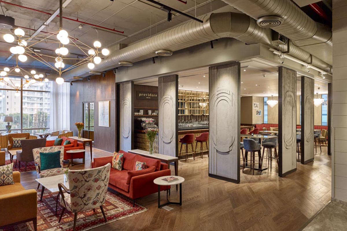
The spread of facilities at The Quorum encompass a reception, members’ lounge, library, work zones, conference and meeting areas, a restaurant, café, bar, a state-of-the art gym by Sumaya and several multi-use studios/ spaces for fitness sessions, screenings, readings, pop-ups, music and other live cultural events. Each of these spaces have a prescribed function and role to play and the design responds to that.[/vc_column_text][/vc_column][/vc_row][vc_row][vc_column][vc_single_image image=”16065″ img_size=”large”][/vc_column][/vc_row][vc_row][vc_column][vc_column_text]With the purpose being to surprise and delight, the idea of layered experiences expressed in The Quorum’s branding identity became a start point for the exercise. The core idea for The Quorum was that it become the member’s third “place” – frequented after their home and office, a place that would allow for relaxation, stimulation and a sense of community in an uncontrived environment of comfort; the design concept, evolved through detailed iterations on how the spaces would reflect and imbibe this idea, rests on the deeply-ingrained collaborative process of Studio Lotus, in which the client is an equal partner in co-authoring the design.[/vc_column_text][/vc_column][/vc_row][vc_row][vc_column width=”1/2″][vc_single_image image=”16066″ img_size=”large”][/vc_column][vc_column width=”1/2″][vc_single_image image=”16067″ img_size=”large”][/vc_column][/vc_row][vc_row][vc_column][vc_column_text]The zoning of the plan became a critical element; it was important to identify the progression of different spaces, as well as how the prospective clientele was anticipated to use them – whether as often frequented shared areas or comparatively secluded private zones. These patterns of usage would determine the placement of spaces with respective to the peripheral glazing. For example, the all-day dining has been placed along the south-eastern edge was placed to get maximum natural light, while the bar was recessed into a darker zone.
These spatial transitions take into account the ebb and flow of footfall throughout the day as well as the week. The layout also accounts for account for segregation of activities, and thus two separate entrances were provided – for members and guests for private events, respectively.[/vc_column_text][/vc_column][/vc_row][vc_row][vc_column][vc_column_text]Since The Quorum would become a recurring experience for its members, a diversity of scale and treatment of the various areas was important. Most large spaces have been broken down into a series of more intimate areas. Materially, there are large gestures that tie the experiences together, but each zone possesses its own visual character, derived from an honest expression of materials and details that manifest the sense of authenticity lying at the heart of the Q Club’s ethos.
Warmth and ease have been rendered into The Quorum to reduce the interior fatigue so that people can keep coming back to the space without it seeming overpowering. While the neutrality of the shell binds the scheme, it is the secondary layer of inserts that creates a distinct story for every space.[/vc_column_text][/vc_column][/vc_row][vc_row][vc_column][vc_single_image image=”16060″ img_size=”large”][/vc_column][/vc_row][vc_row][vc_column][vc_column_text]The process of choosing materials was driven by the intent of each experience. For instance, the reception creates an ‘entrance experience’ as ‘The Alley’: an art gallery that transforms every quarter with a new exhibition from the Kiran Nadar Museum of Art, one of the finest art collections in the country. While the deliberately muted shell keeps the focus on the stunning art, the layering seen in the logo, repeated as myriad graphic interpretations across the various spaces, is reflected in the nuanced construction details of its wood panelling and flooring pattern. The restaurant Coalesce, on the other hand, is a brightly-lit fresh white space infused with greenery and pop wallpaper to recreate the casual charm of a ‘sitting in your verandah’ story.[/vc_column_text][/vc_column][/vc_row][vc_row][vc_column width=”1/2″][vc_single_image image=”16061″ img_size=”large”][/vc_column][vc_column width=”1/2″][vc_single_image image=”16062″ img_size=”large”][/vc_column][/vc_row][vc_row][vc_column][vc_column_text]Rigorous prototyping was done for elements such as the sandcast brass tiles of the Providore Bar developed by Mukul Goyal, and large sliding acoustic relief panels used to modulate the scale of the space depending on group sizes and functions. An elevated meeting room is the nerve centre of The Q and opens up to become a stage for live performances. There is a panelled library room on one side of the lounge where the bookshelves swivel to reveal an Prohibition Era ‘Secret room” that can be booked by Guests for meeting requiring discretion.[/vc_column_text][/vc_column][/vc_row][vc_row][vc_column][vc_single_image image=”16057″ img_size=”large”][/vc_column][/vc_row][vc_row][vc_column][vc_column_text]Across the gallery lies the public zone, which houses the Screening Room, the Oak&Cru Event Space, the gym and the pre-function area. The event space and the screening room are fairly similar in their visual language, with timber rafters and wooden panelling along the walls; the Screening Room can comfortably seat upto 50 people at a time. Besides the Screening Room is the Gym, which has placed along the western edge of the floorspace, to ensure ample ingress of natural light through the full glazing along the peripheral wall. The gym features a markedly less dense visual vocabulary, the yellow ceiling offsetting the muted shell; the Screening Room has been conceptualized as an extension to the gym, allowing for flexibility of function and enabling use by larger groups of people as and when required.[/vc_column_text][/vc_column][/vc_row][vc_row][vc_column][vc_single_image image=”16058″ img_size=”large”][/vc_column][/vc_row][vc_row][vc_column][vc_single_image image=”16068″ img_size=”large”][/vc_column][/vc_row][vc_row][vc_column][vc_column_text]Tying together the spatial narrative is the pre-function area, which doubles up as an all-day eatery, Café Reed; a vibrant zone – with the lush backdrop of bamboo fronds beyond the café counter juxtaposed with the geometric wooden panelling screening off Oak&Cru – Café Reed provides a functional complement to the spaces surrounding it, be it as the breakfast space for gym-users, a vestibule for Oak&Cru, or a spill-out area for the Screening Room. The loose wooden furniture, diagonal grid of globe lighting, and exposed service ducts enforce the distinctly informal ambience of the space.[/vc_column_text][/vc_column][/vc_row][vc_row][vc_column][vc_single_image image=”16059″ img_size=”large”][/vc_column][/vc_row][vc_row][vc_column][vc_column_text]Photographer: Randhir Singh.[/vc_column_text][/vc_column][/vc_row][vc_row][vc_column][vc_column_text]PROJECT CREDITS
Interior Design: Studio Lotus
Lead Designer: Pankhuri Goel
Design Team: Parija Chandra, Swati Agarwal, Arun Sharma[/vc_column_text][/vc_column][/vc_row]
