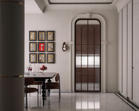
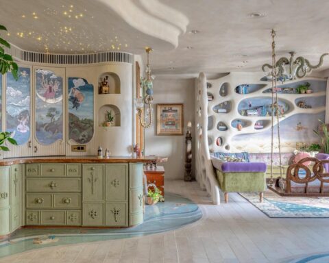
a lively-luxurious home with a serene environment filled with art and accent pieces and a neutral colour palette.
Project Name : Gurgaon Residence
Project Location : Gurgaon, India
Project Site Area : 2,800 sq. ft.
Architects/Designer : MADS Creations
Project Status : Built
Photographer: Atul Pratap Chauhan
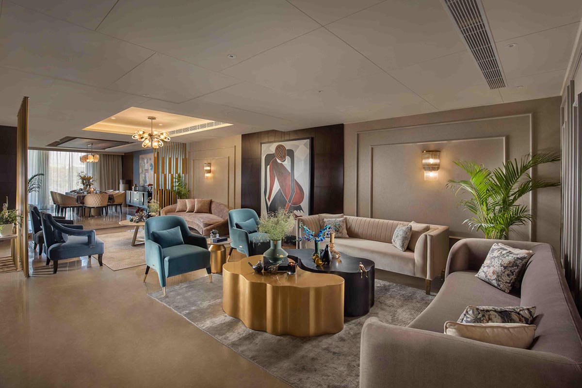
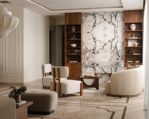
Luxe neutral spaces come alive with rich accent materials, colours and opulent finishes in this three-bedroom apartment with an expansive open-plan living-dining area and an exquisitely designed bar and lounge. The muted palette of the backdrop brings a unique textural quality to the space, while also highlighting the charming details on the walls and ceilings and the custom designed furniture with its elegant silhouettes.
Text description by the designers.
The idea was to create a lively and luxurious home that was not overbearing in terms or colours for a young couple. The clients wanted a serene environment filled with artworks and accent pieces that spoke of their personality. The neutral colour palette that we followed was in line with what our clients had in mind to bring about calmness and harmony in the space.
Dlf Phase 4, Gurgaon, the 2,800 sq. ft. luxurious apartment. It was a four-bedroom apartment. We converted one bedroom into the TV lounge by breaking down walls to open up the area and make it look more spacious.
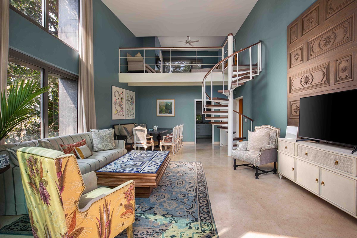
As you enter the home, you step into the foyer area. Moving into the central area of the home, you are greeted by an expansive, linear space which we have divided into three specific areas. The raised area on one end is the dining room, while the rest of the area is treated as two clusters of living area.
Next to the living room is the kitchen custom designed by us to create a sleek and clean look, which comes from the neutral colour palette we have chosen.
Opposite the kitchen is the most loved space of the home, the bar which appears like an accent piece in itself. Adjoining the bar is the family lounge, the most comfortable and inviting space of the home. It is separated from the bar by a metal partition with intricate detailing.
The master bedroom is located next to the lounge with a connection to the balcony.
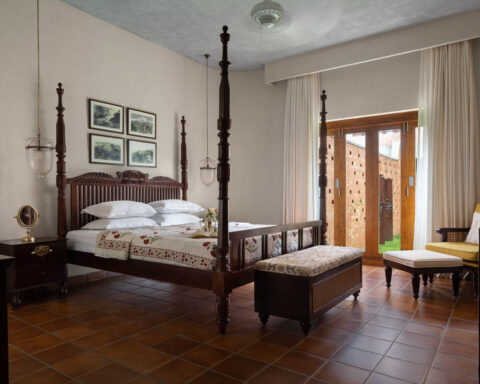
The other two bed rooms are located in the front side of the home, with each of them having their own theme around a neutral colour palette. The bigger room also has a connected wardrobe area and dresser next to the washroom.
The smallest of all rooms is also the cosiest, with a neutral colour palette that highlights beige shade.
Open planning has very much been in trend for a long time now, and this home clearly is a great example of it. The way we have treated the expansive linear space from the dining room to the end of the home, that is the lounge, allows the viewer to have a look of the entire home in one go, yet creating enough privacy for each area. With a lack of too many walls, except for the bedrooms, we have used clusters of furniture and gold-finished metal screens to define spaces, creating a luxurious vibe.
The home is a true blend of modern luxury and a few traditional elements, like the mouldings and panels on the wall. The home follows a neutral colour palette with pops of colours, textures and materials. The open plan allows for use of numerous colours and creating a theme that is lively and easy on the eye. Every space has its own theme while still being connected to each other.
Colours chosen for furniture, fabrics, walls and even carpets come together through the neutral base chosen. We then add pops of blue and gradient neutral shades to create interest. Gold accents blend with dark shades of black and brown. The artworks bring in bright shades of orange and blue complementing the other elements. Green is another influential colour brought in by the plants placed in the various corners of the home. Marble used in furniture pieces coupled with plush upholstery creates a well-balanced palette.
Most enjoyable part of the project was its planning because we had a bare shell in front of us with a lot to offer. The same spaces as we have utilised could be utilised for so many different purposes. We settled on the planning keeping in mind the client’s preferences and what the space would be used for in the future. The linear stretch of open space was also a challenge because we wished to optimally utilise the space while still adding enough elements that didn’t hinder the openness.
Modern luxury is our design style and in a way most of our design philosophy. Our signature print can be seen in the kind of pieces we have picked for this home, from wall lights to furniture pieces. Our expertise is in playing with materials and colours which is clearly reflected in every corner of this home.
Every space including bedrooms, lounge, living area and dining area even is connected with each other in a way. The theme we have followed gives individual personality to each space along with the décor employed there. The furniture in the specific area is what allows us to pick different décor themes. We have experimented with accessories, their colours, and the artworks picked for the varied walls.
We have tried to bring in plants in every corner available to us inside this home. The idea is to add freshness and natural energy to the interiors, as well as improve the visual impact, and quality of the air within the home.
Photographer: Atul Pratap Chauhan
PROJECT CREDITS
Interior Design : MADS Creations
Principal Designers : Meenu Agarwal
