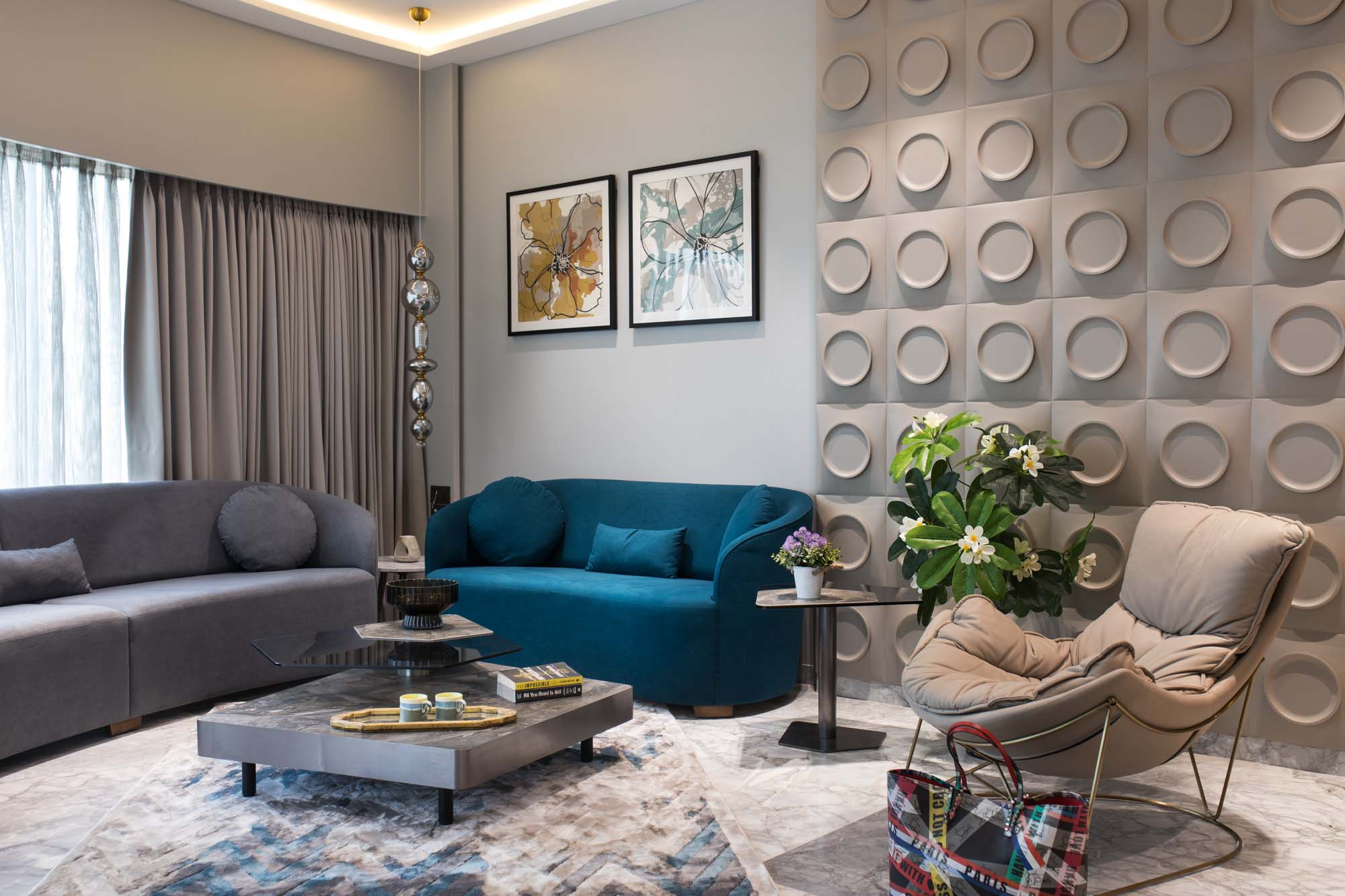
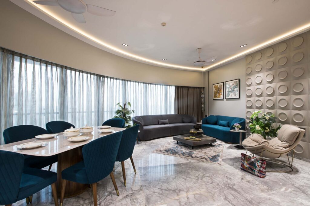
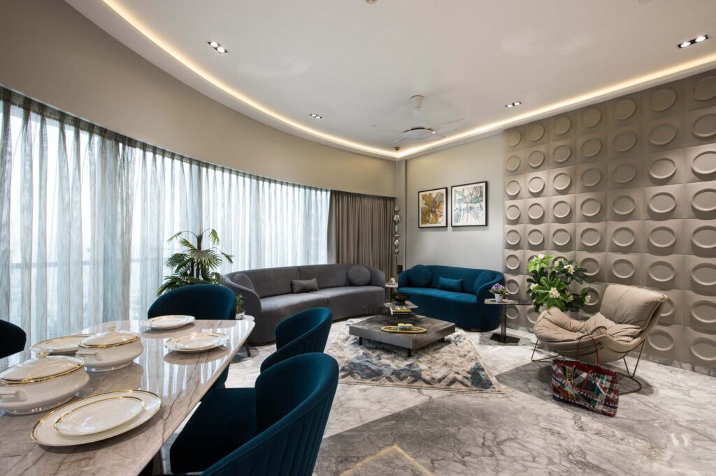
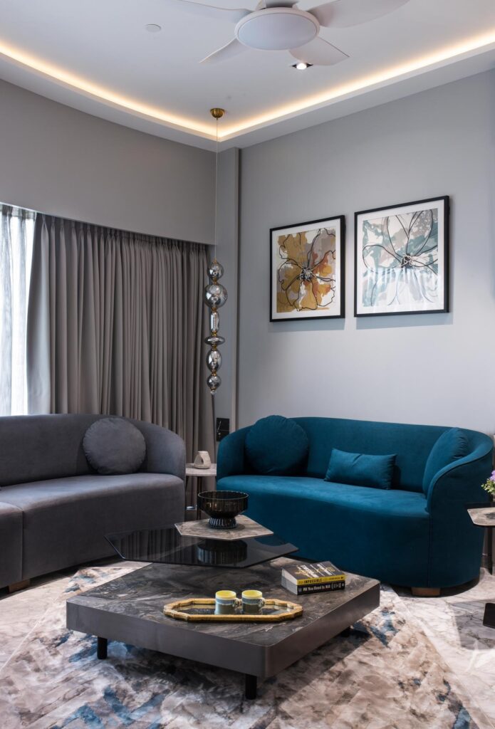
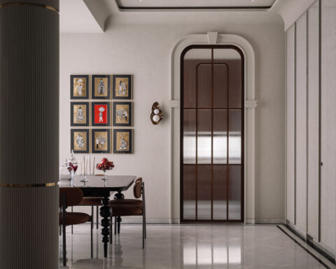
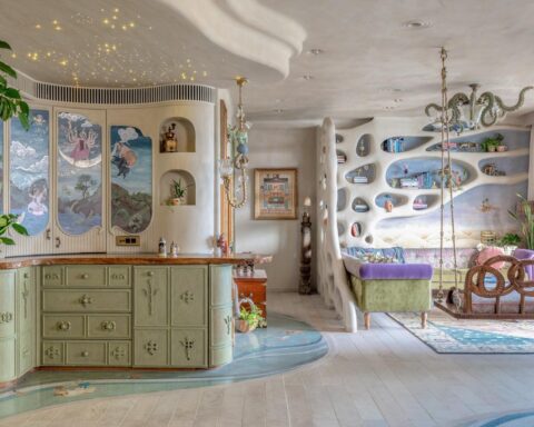
The central idea of this Mumbai House is to create a spacious and open feel for the house, with the passage space adding an element of interest to enhance the overall design. The main concept revolves around creating a space that is open and youthful in its design approach.
Project Name : World Tower
Project Location : Pune, India
Architect/Interior Designer : Asumi Rawat Desiign
Principal Designer : Asumi Rawat
Photographer: Subhash
Text description by the architects.
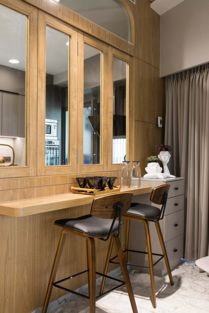
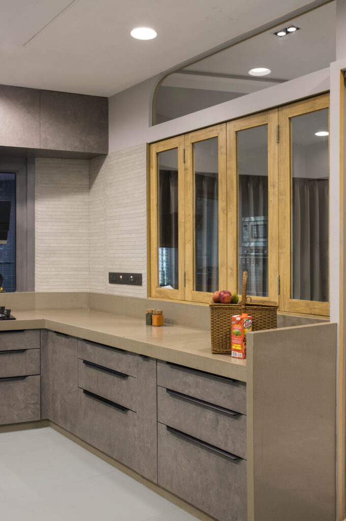
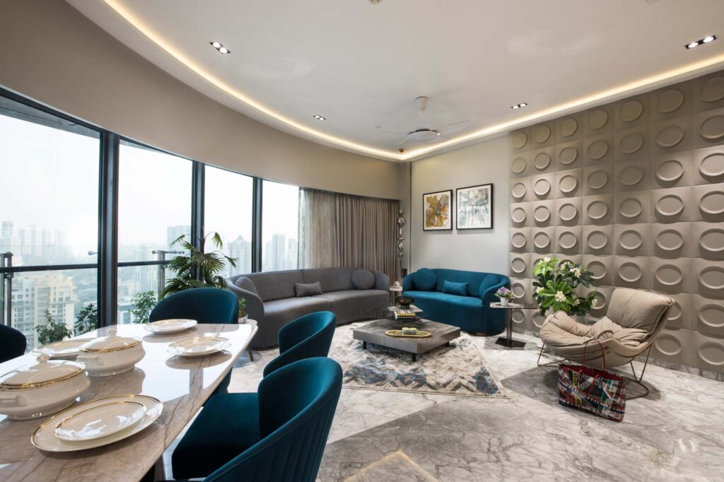
The client sought a modern and minimalist design for their three-bedroom apartment, with a preference for a semi-open kitchen concept.” The key focal point shaping the entire layout is the curved face, dictating the circulation of everything around it.
The central idea of the project is to create a spacious and open feel for the house, with the passage space adding an element of interest to enhance the overall design. The main concept revolves around creating a space that is open and youthful in its design approach. The colour scheme aims to be soothing, aligning with the client’s primary request for a personalized home design rather than a hotel-like feel.
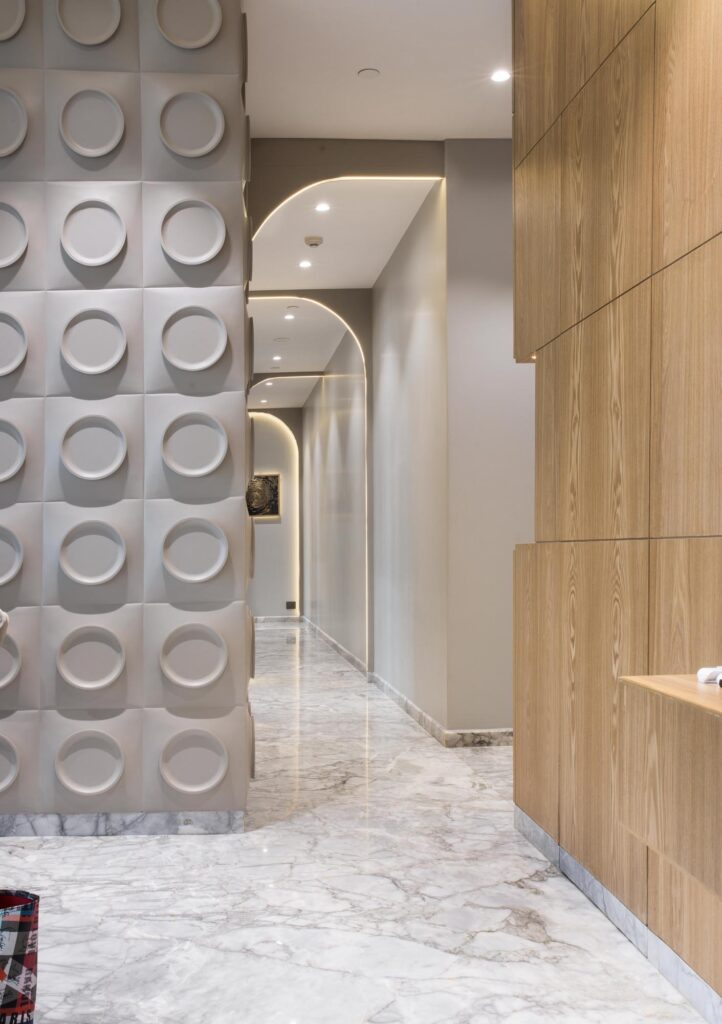
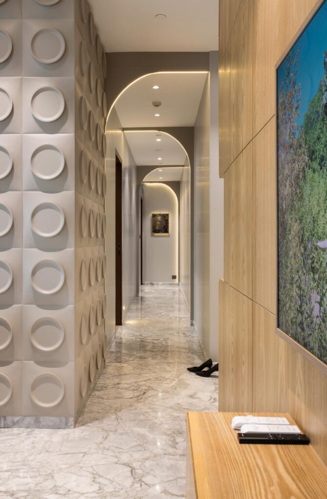
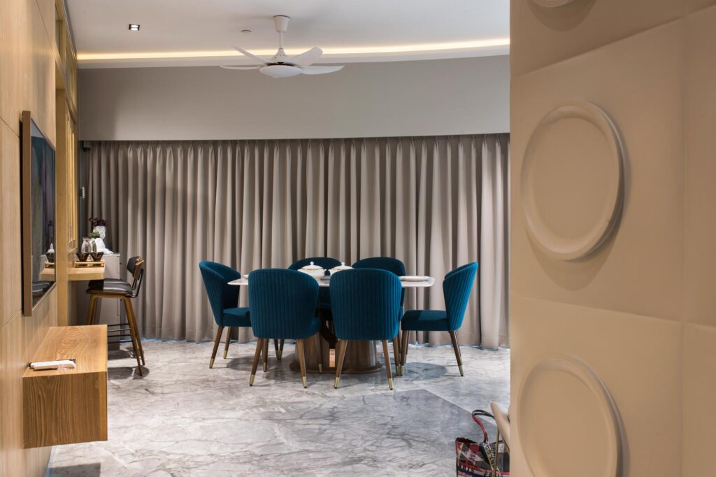
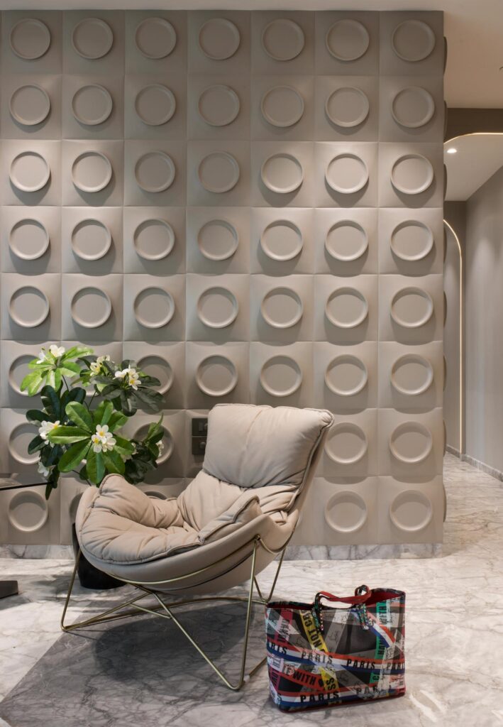
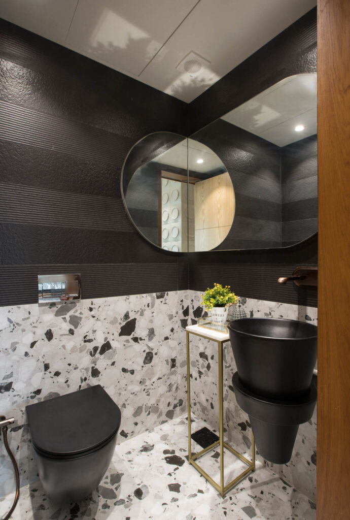
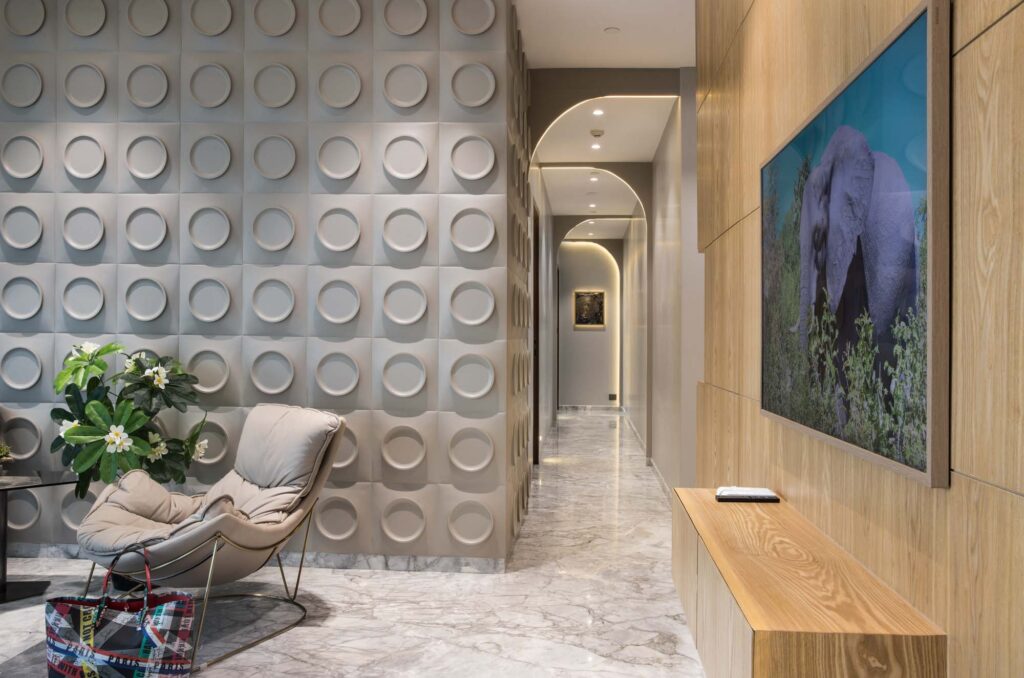
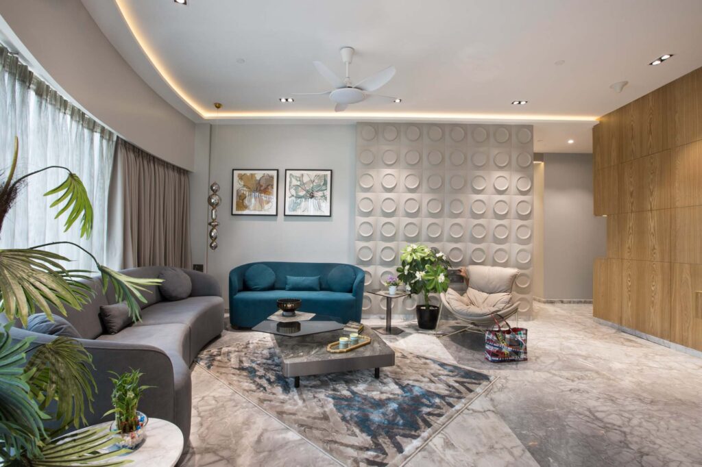
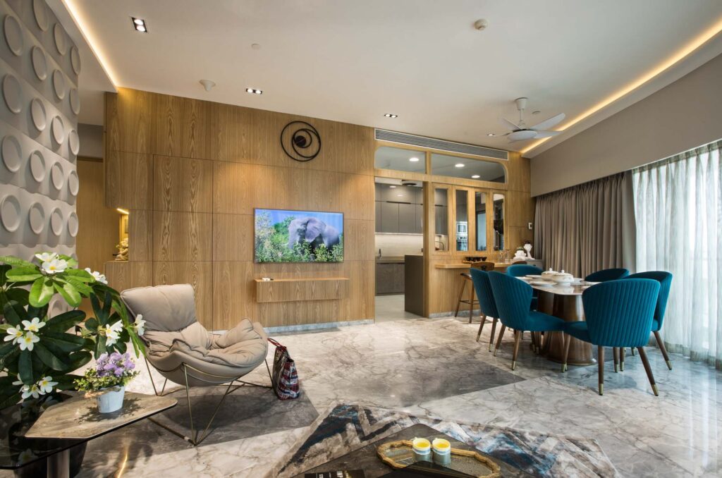
Upon entering through the main door, you’re greeted by a grey-painted wall adorned with circles. Veneer extends from the TV wall to the kitchen, cleverly concealing the powder room door. The small powder room features a captivating geometric design with mirrors on two adjacent walls, creating a sense of depth. The semi-open kitchen complements a living room adorned with a striking curved sofa in two hues: emerald green and steel grey.
On the opposite side, the home features a captivating passage with alternating semi-circular forms accentuated by strategically placed lights, creating an intriguing visual dynamic.
The client comprises a family of four, including a young girl in her early twenties and a son in his late teens, creating a diverse and dynamic household.
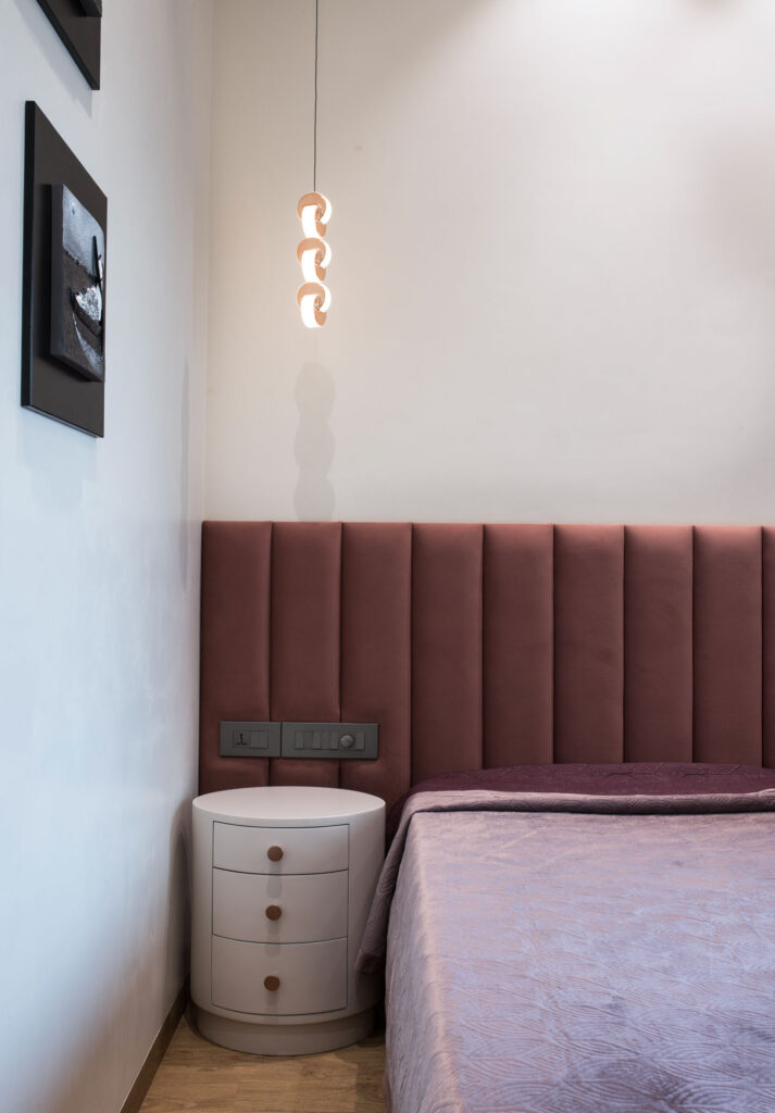
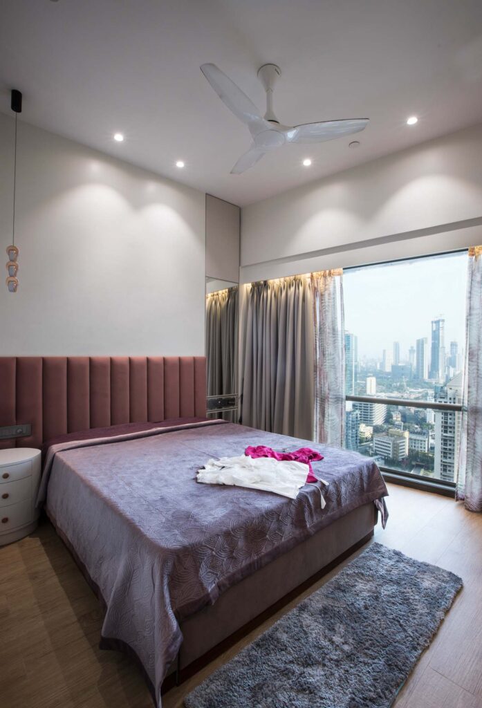
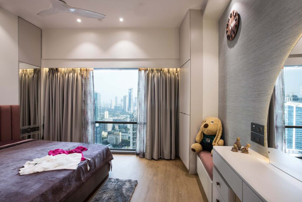
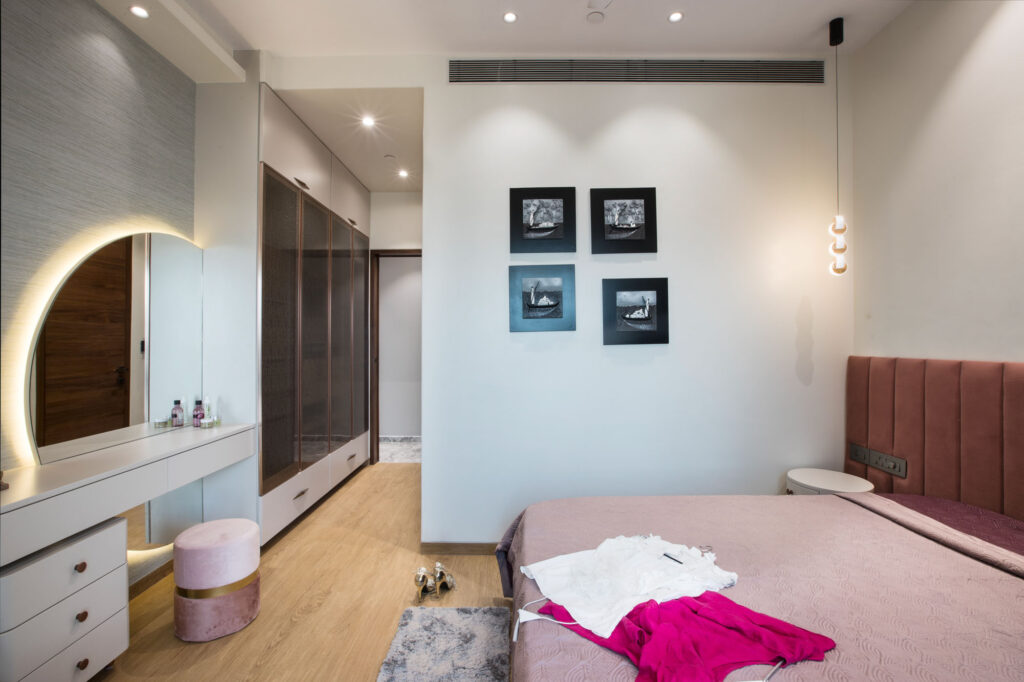
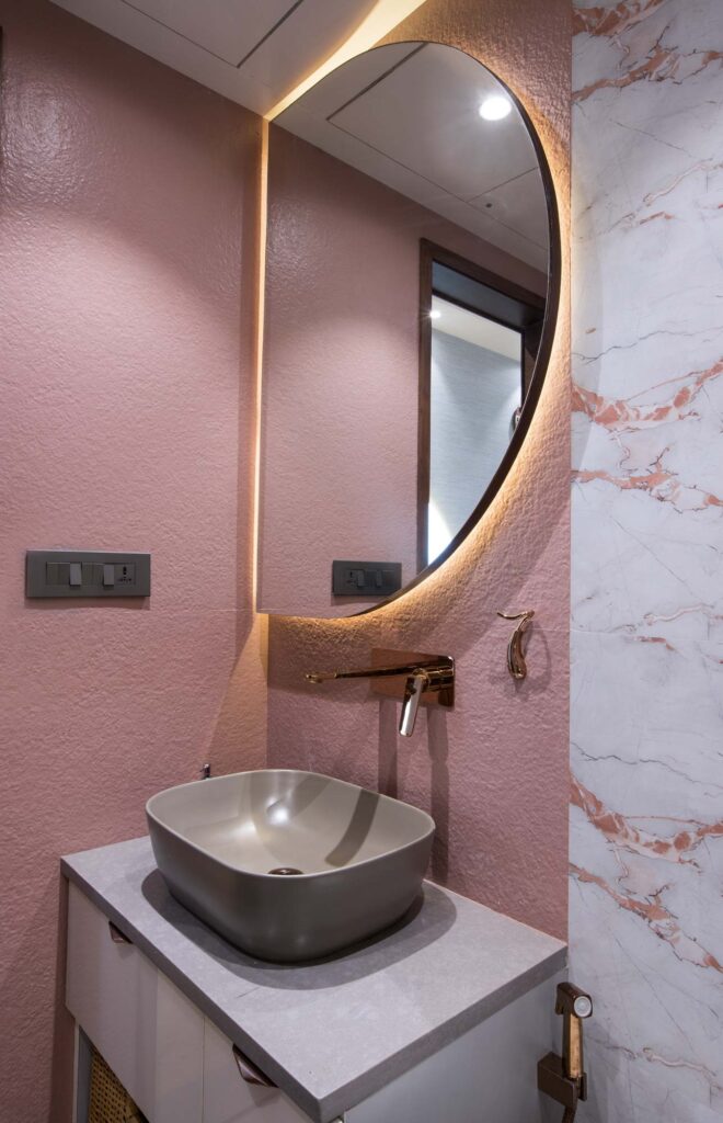
The daughter’s room reflects her love for pink, subtly incorporated in the headboard and curtains, while a wooden floor adds warmth. The room maximizes space utilization cohesively, balancing functionality without overtly displaying storage. The bathroom seamlessly extends the bedroom’s color scheme, creating a harmonious and connected aesthetic.
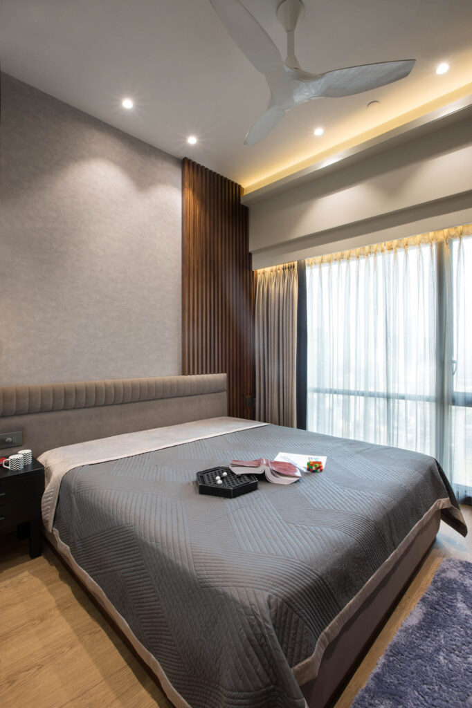
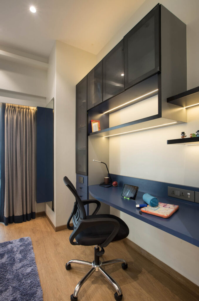
The son’s room showcases a dominant blue and grey color combination, featuring textured concretelooking wallpaper and a complementing wooden floor. The cohesive design extends into his bathroom, maintaining the same color scheme for a seamless transition and aesthetic consistency.
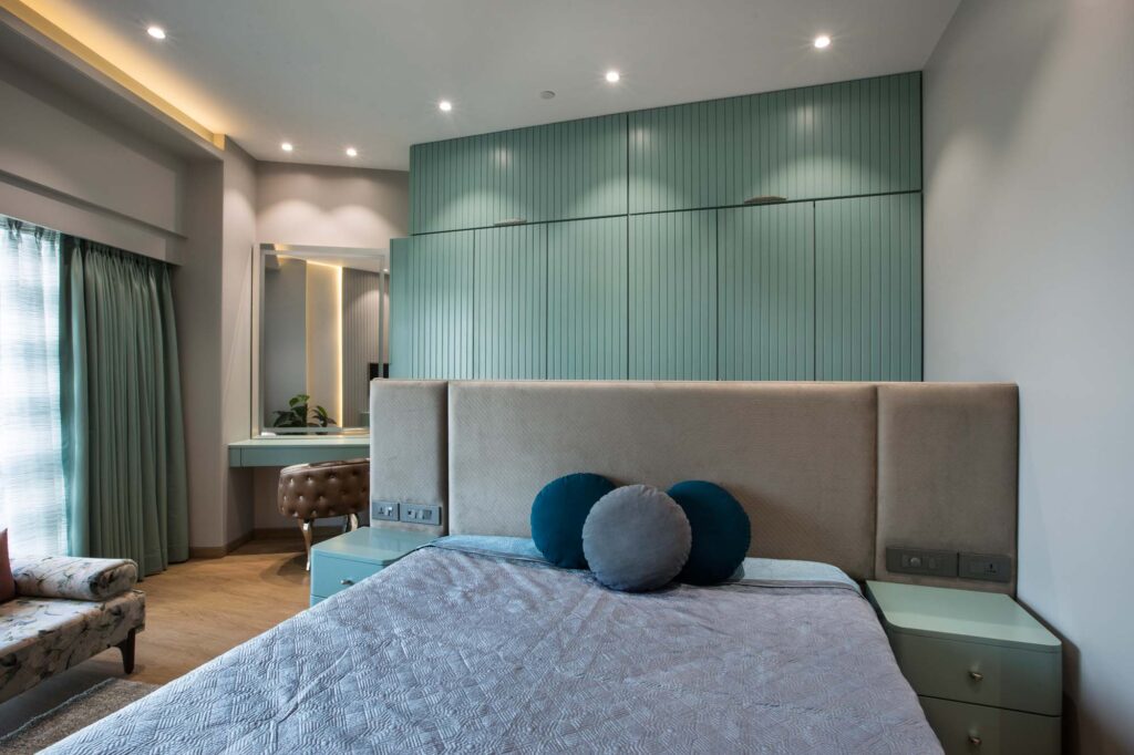
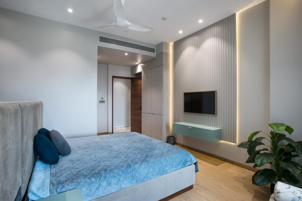
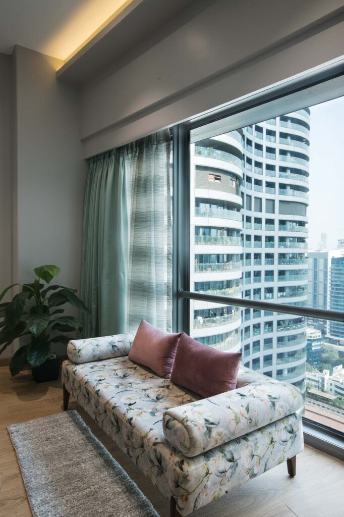
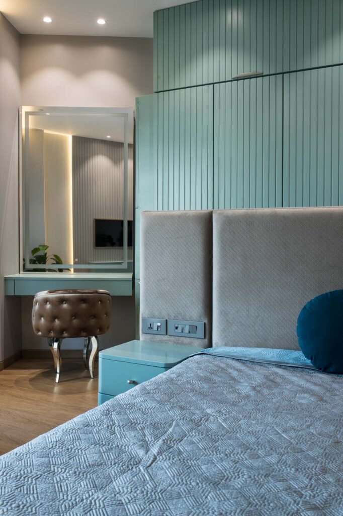
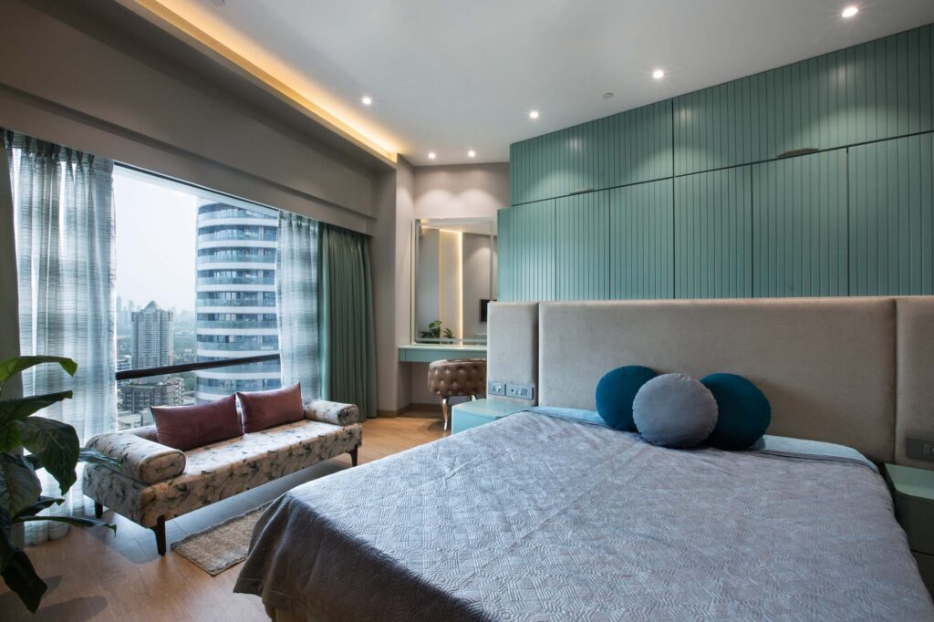
Designing the master room posed a challenge due to its angular wall, but a clever solution was found. Placing the wardrobe behind the bed and creating a panelled wall look for the bed itself served to make the room appear more spacious while addressing the unique layout. The master room is adorned with a delightful combination of mint green and grey, complemented by an elegant articulated sofa with a floral touch, enhancing the overall decor of the space.
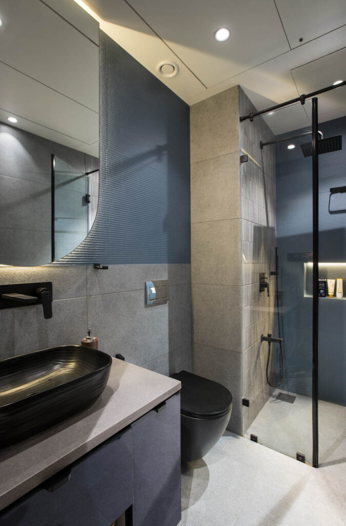
Continuing the design theme from the master bedroom, the master bathroom features a harmonious blend of green and grey, creating a seamless and cohesive aesthetic throughout the space. The primary challenge in this project was maximizing space in bathrooms and bedrooms, strategically incorporating storage in every available area while maintaining a spacious feel without an overt display.
The beauty of the home is accentuated by the subtle colors, thoughtful use of materials such as PDF, mirrors, and textured walls, along with the artful layering of various materials, creating a visually appealing and textured environment.
Project Name : World Tower
Project Location : Pune, India
Architect/Interior Designer : Asumi Rawat Desiign
Principal Designer : Asumi Rawat
Photographer: Subhash
