[vc_row][vc_column][vc_custom_heading text=”The beehive office by Luigi Rosselli reuses waste terracotta tiles for a contemporary construction.” use_theme_fonts=”yes”][/vc_column][/vc_row][vc_row][vc_column][vc_column_text]Project Name : The Beehive
Project Location : Surry Hills, Australia,
Architects/Designer : Luigi Rosselli, Raffaello Rosselli
Project Status : Built
Instagram : @luigirosselliarchitets , raffaellorosselliarchitects[/vc_column_text][/vc_column][/vc_row][vc_row][vc_column width=”1/2″][vc_single_image image=”16761″ img_size=”full”][/vc_column][vc_column width=”1/2″][vc_single_image image=”16762″ img_size=”full”][/vc_column][/vc_row][vc_row][vc_column][vc_column_text]Text description by the architects.
Revaluing Waste
Architecture is often reliant on expensive and scarce materials to define its value. The beehive explores how an undervalued waste product, like the ubiquitous terracotta roof tile can be redefined and revalued. This exploration of waste as a material stems from the knowledge that construction creates up to 50 percent of Australia’s waste output; and that a buildings energy footprint is largely based on the materials embodied energy. Material reuse solves both these environmental impacts and is by far the most efficient form of building. Raffaello Rosselli collaborated with Luigi Rosselli architects to design their new office building. Through experimenting with waste material reuse on its own studio it aims to be a role model for future projects.
[/vc_column_text][/vc_column][/vc_row][vc_row][vc_column][vc_single_image image=”16763″ img_size=”full”][/vc_column][/vc_row][vc_row][vc_column width=”1/2″][vc_single_image image=”16764″ img_size=”full”][/vc_column][vc_column width=”1/2″][vc_single_image image=”16765″ img_size=”full”][/vc_column][/vc_row][vc_row][vc_column][vc_column_text]
Search for a waste material
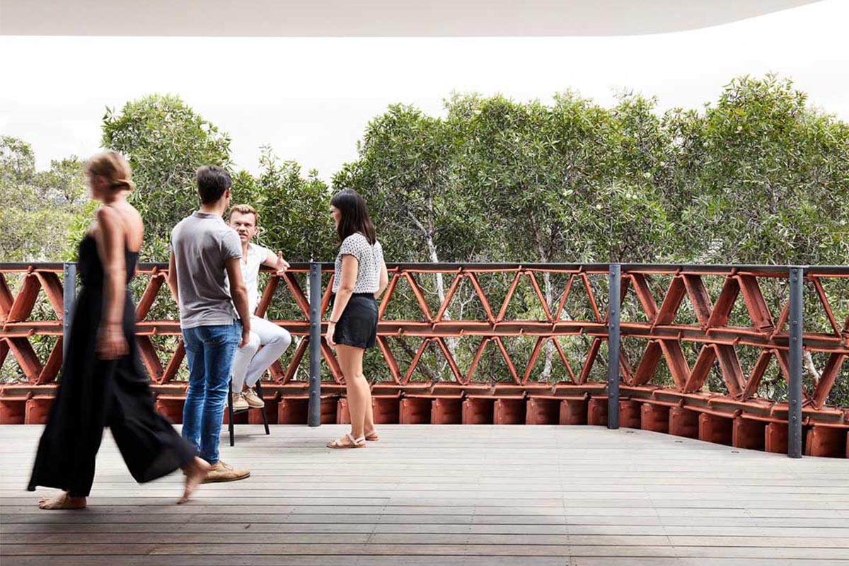
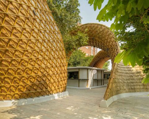
The project started with the study of material waste streams looking for an appropriate object for a brise-soleil to filter the harsh western sun that the main façade faces. The terracotta tile, an overlooked symbol of suburbia, was chosen as it is easily sourced and without an adequate reuse market. (While out of manufacture tiles are collected, newer tiles have no market value and find their way to landfill.) Putting aside the tiles commonality, the terracotta tile appealed in its raw elemental materiality, with no tile exactly alike, cast in clay and fired still by hand. Contextually, the terracotta also related to the raw brick materiality of the neighbouring masonry buildings.
[/vc_column_text][/vc_column][/vc_row][vc_row][vc_column width=”1/2″][vc_single_image image=”16766″ img_size=”full”][/vc_column][vc_column width=”1/2″][vc_single_image image=”16767″ img_size=”full”][/vc_column][/vc_row][vc_row][vc_column][vc_column_text]
Designing through making – 1:1 prototypes
The process of design was also unique for this building. In response to an object which was geometrically complex, the façade design was largely conceived through multiple full scale tests and hand built prototypes. This opened up an intuitive form of designing through making. The tactility of the process allowed rapid prototyping, including experimenting with multiple tile course types.
[/vc_column_text][/vc_column][/vc_row][vc_row][vc_column][vc_column_text]
These prototypes informed the final design, where each tile course was placed based on its function. The acute course was used at the bottom due to its strength, as well to obscure the solid spandrels. Equilateral tiles were used at eye level to reduce visual obstructions. While diagonal tiles were used at the top due to their low clearance and were angled north. The variation of tiles also allowed us to hide the slab edges that reduced the structural load to single stories discreetly. This design process allowed us to make of the use of the module to further tackle challenging elements of the design and resolve them physically. Such as the curved tile façade, which was crucial to give the façade proportion within its built context by linking its misaligned neighbouring buildings and stepping back from the paperbark tree in front of the site.
[/vc_column_text][/vc_column][/vc_row][vc_row][vc_column][vc_single_image image=”16760″ img_size=”full”][vc_single_image image=”16769″ img_size=”full”][/vc_column][/vc_row][vc_row][vc_column][vc_column_text]
Responding to the site.
The projects primary gestures came through a consideration of its immediate context. The building’s form responds to the neighbouring setbacks and heights. As well as curving around the paperbark street tree (Melaleuca) which encroaches the site. The brise-soleil façade filters the harsh sun while at the same time maximising light through the small 8m wide frontage. The façade retains the feeling of the two storey warehouse to the south, with the top level set back. The curved awning raises above the first floor to match its context and provides a generous interface with the street.
[/vc_column_text][/vc_column][/vc_row][vc_row][vc_column width=”1/2″][vc_single_image image=”16772″ img_size=”full”][/vc_column][vc_column width=”1/2″][vc_single_image image=”16771″ img_size=”full”][/vc_column][/vc_row][vc_row][vc_column width=”1/2″][vc_single_image image=”16777″ img_size=”full”][/vc_column][vc_column width=”1/2″][vc_single_image image=”16778″ img_size=”full”][/vc_column][/vc_row][vc_row][vc_column][vc_column_text]
Internally the building houses, amongst other commercial spaces, a light-filtered architecture studio designed as an environment to stimulate creativity and teamwork: a ‘Beehive’ of architects. Challenging the generic and often alienating nature of open plan office buildings, the design sought to provide an active but intimate environment with multiple working positions offered by custom-built joinery, which was largely repurposed from the former studio, another component of the up cycling drive on this project. The main space does not have any walls, rather is defined by two linear rows of semi-enclosed booths with each architect provided with two desks, linked by a long linear standing bench which facilitates collaborative work.
[/vc_column_text][/vc_column][/vc_row][vc_row][vc_column][vc_single_image image=”16776″ img_size=”full”][vc_single_image image=”16774″ img_size=”full”][vc_single_image image=”16773″ img_size=”full”][/vc_column][/vc_row][vc_row][vc_column][vc_column_text]
On the top floor, a communal garden terrace offers a point of release to work in the sunshine, hold community events or relax after a long day. Below this level, the conference table is semi-enclosed by a terracotta tile bookshelf, another variation of a stacked terracotta module, brought into the interiors. This was a conscious attempt to re-contextualise the value of reusing materials, advocating for more sustainable solutions and showing clients and the wider public that it is possible to reuse the waste products of the construction process, with all their intrinsic beauty from façade design to the displaying of books.
[/vc_column_text][/vc_column][/vc_row][vc_row][vc_column][vc_single_image image=”16779″ img_size=”full”][/vc_column][/vc_row][vc_row][vc_column][vc_column_text]
Photographer: Ben Hosking, Prue Ruscoe, Callum Coombe, Raffaello Rosselli.
[/vc_column_text][/vc_column][/vc_row][vc_row][vc_column][vc_column_text]PROJECT CREDITS
Architecture: Luigi Rosselli, Raffaello Rosselli
Builder: Jim Miliotis for GroundUp Building Pty Ltd
Façade Construction : Callum Coombe
Landscape Architect: William Dangar Associates
Joiner: Maluva Joinery Pty Ltd
Custom Brass Lighting: Oliver Tanner
Client : Luigi Rosselli Architects
[/vc_column_text][/vc_column][/vc_row]
