[vc_row][vc_column][vc_custom_heading text=”Residence by Indore based studio reflective practices.” use_theme_fonts=”yes”][/vc_column][/vc_row][vc_row][vc_column][vc_column_text]Project Name : Ashish & Amilesh Jain Residence
Project Location : Indore, Madhya Pradesh, India
Project size : 18,000 sq. ft.
Architects/Designer : Reflective Practices
Project Status : Built
Instagram : @reflective_practices[/vc_column_text][/vc_column][/vc_row][vc_row][vc_column][vc_single_image image=”16613″ img_size=”full”][vc_single_image image=”16614″ img_size=”full”][/vc_column][/vc_row][vc_row][vc_column][vc_column_text]Text description by the architects.
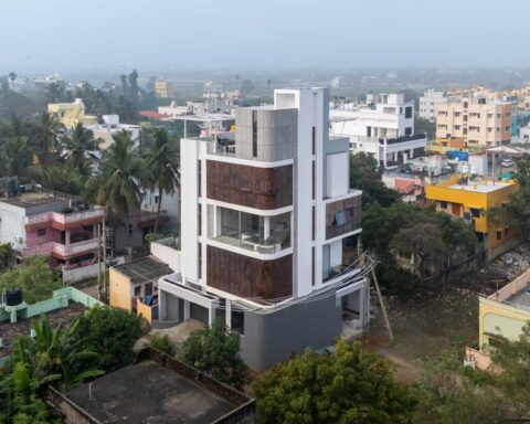
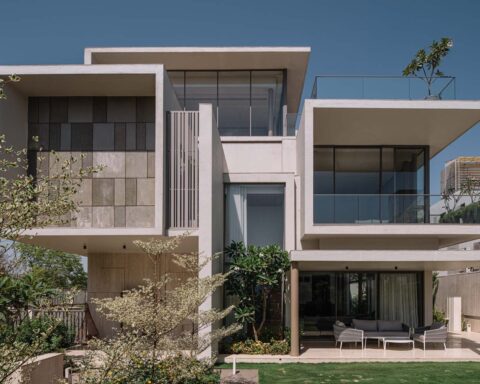
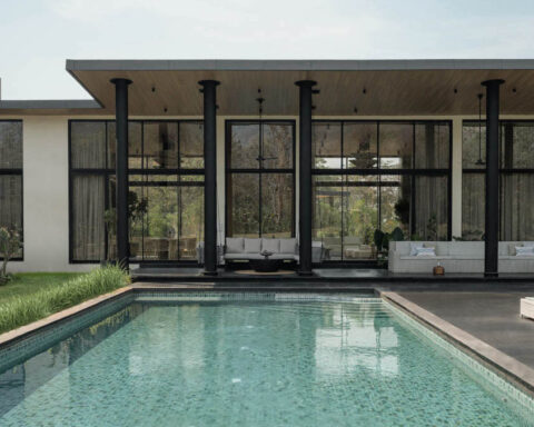
With the given gist the architecture of this house has been developed, it’s a symmetrical expression of fairly simple detailing. It is a set of high volume entryways, cantilevered balconies of bedrooms, double height window openings. These two set combines and meets at a common plane where both the families interact and that is the first floor landscaped balcony. This is a most frequently used space of the house which the client always wanted to have. Peeping inside from this space, we see a twin height living room and one more spill out space at the second floor where the bedrooms open up. This plane offers a sit out area from where one can have a connection with the first floor living area and the common landscaped balcony. What a joint family needs is this connection at every moment and this was the concept around which the horizontal and vertical planning of spaces was done.
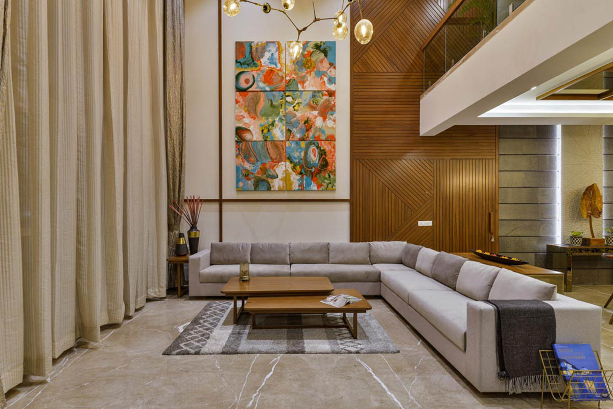
The materials used in the exterior are wood, travertine stone and river washed black granite. The stout character of granite take place at the bottom part of the entire elevation, it creates grandness by dressing the double height entryway, the river washed texture compliments the earthy look of the ground floor where we have created two semi-covered green pockets. The travertine stone with its rich grainy pattern dresses the double height wall. The subtle character of wood creates the warmth by dressing the underneath of the large roof slab.[/vc_column_text][/vc_column][/vc_row][vc_row][vc_column][vc_single_image image=”16586″ img_size=”full”][/vc_column][/vc_row][vc_row][vc_column][vc_column_text]The living room has a double height volume and it gets highlighted with simple grooving details on walls and ceiling painted in taupe shade. A custom made set of hanging lights spread out its arms randomly and fills the volume. The wall which is the background for sofa seating is a long double height wall. It starts with blank canvas for a huge artwork with demarcation of wooden battens. The wooden element creates a dynamic pattern spreading thorough the height and concealing a common door between the two houses and then it solidifies further with a rustic cladding of basalt stone.
The heaviness of these materials gets broken down with the use of a sand stone panel. The panel has engraving of leaf-veins. The overall play on the wall is a mix of silence and vibrance and so we chose an artwork like fluid art for this wall to show the fluidity of emotions.
The mirror on ceiling above the dining table doubles up the energy served on the table. The table top is a wooden surface with semi precious stone inlay. A bespoke buffet counter and a set of monochrome wall plates enhance the experience of this space.[/vc_column_text][/vc_column][/vc_row][vc_row][vc_column width=”1/2″][vc_single_image image=”16589″ img_size=”full”][/vc_column][vc_column width=”1/2″][vc_single_image image=”16588″ img_size=”full”][/vc_column][/vc_row][vc_row][vc_column width=”1/2″][vc_single_image image=”16591″ img_size=”full”][/vc_column][vc_column width=”1/2″][vc_single_image image=”16590″ img_size=”full”][/vc_column][/vc_row][vc_row][vc_column][vc_column_text]The Master Bedroom
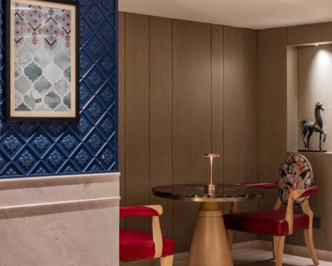
A geometrical pattern in black stone inlayed in white marble with brass element creates the backdrop for the bed. This pattern is laid over a set of panels with cove lights around creating the main feature for this bedroom. The geometrical expression continues over the bed headboard and drawer fronts of the nightstands and console. The fluted fabric upholstery over the furniture in a stark shade of blue breaks the monotony of colours of this space. The freshness and simplicity of this bedroom creates a clam and serene experience for the user.[/vc_column_text][/vc_column][/vc_row][vc_row][vc_column][vc_single_image image=”16592″ img_size=”full”][/vc_column][/vc_row][vc_row][vc_column][vc_column_text]A pastel bedroom is always a requirement for a teenage girl. This bedroom has a semi classical language. The wall mouldings, checkered glass front of cabinets, moulding details on the nightstand creates the semi-classical language whereas the use of rose gold metal framed glass shelves, polka dot print study table top and ceiling in mirror creates contemporary balance of the space. The use of powder pink tone with rose gold metal and some hues of mint colour create a soothing colour palate.[/vc_column_text][/vc_column][/vc_row][vc_row][vc_column width=”1/2″][vc_single_image image=”16593″ img_size=”full”][/vc_column][vc_column width=”1/2″][vc_single_image image=”16594″ img_size=”full”][/vc_column][/vc_row][vc_row][vc_column][vc_column_text]Foyer is a welcoming space at the ground floor, it has detailing of veneer paneling encasing the passage way. It brings you to a sofa seating which has intricate Indian motifs on the upholstery; a white console creates the backdrop and a stand for artefacts. A circular ceiling covered in wallpaper compliments the gentle Indian
motives on the upholstery. The foyer opens up to the drawing room through a large glass partition, thus allowing a transparency of space. The clear vision starts gelling into the design of drawing room. The drawing room is designed keeping the large space in mind. The large space allows the clients to host small parties at their home without disturbing the living areas on the first floor. The space was large and it needed to have minimal use of paneling on wall, so we have created a drama of patterns with simple wall mouldings in POP, highlighted it with taupe colour and gave it energy with a customised hanging light fitting at the center of the ceiling. The pale pink glass of the light fitting compliments the taupe shade used on the walls and the tapestry used. The wall décor and serving tables have hints of rose gold, metallic black and turquoise which creates the overall colour palate for this room. Opulence in design is not always using a lot of materials and expensive finishes, it is about balancing them. A simple experiment of mixing the right colours and geometry is what we have experimented in this space.
[/vc_column_text][/vc_column][/vc_row][vc_row][vc_column width=”1/2″][vc_single_image image=”16596″ img_size=”full”][/vc_column][vc_column width=”1/2″][vc_single_image image=”16595″ img_size=”full”][/vc_column][/vc_row][vc_row][vc_column width=”1/2″][vc_single_image image=”16598″ img_size=”full”][/vc_column][vc_column width=”1/2″][vc_single_image image=”16597″ img_size=”full”][/vc_column][/vc_row][vc_row][vc_column][vc_column_text]Photographer: Pixcelcraft.[/vc_column_text][/vc_column][/vc_row][vc_row][vc_column][vc_column_text]PROJECT CREDITS
Architecture – Interior Design: Reflective Practices, Indore
Principal Architects: Vrushali Pavaskar Sethi, Ashish Sethi
Design Team: Yogesh Jain, Nazneen Indorewala, Shalini Gupta, Onal Kothari, Ankita Jain[/vc_column_text][/vc_column][/vc_row]
