[vc_row][vc_column][vc_custom_heading text=”Daler Restaurant, New Delhi by Design Ethics Architecture Studio” use_theme_fonts=”yes”][/vc_column][/vc_row][vc_row][vc_column][vc_column_text]Project Name : Daler Restaurant
Project Location : New Delhi, India
Project size : 2100 sq. ft.
Architects/Designer : Design Ethics Architecture Studio
Project Status : Built
Website : www.designethics.co.in
Instagram : @design_ethics_studio[/vc_column_text][/vc_column][/vc_row][vc_row][vc_column][vc_single_image image=”16322″ img_size=”large”][/vc_column][/vc_row][vc_row][vc_column width=”1/2″][vc_single_image image=”16323″ img_size=”large”][/vc_column][vc_column width=”1/2″][vc_single_image image=”16324″ img_size=”large”][/vc_column][/vc_row][vc_row][vc_column][vc_column_text]text description by the architects.
Our young clients, with whom we have associated previously for other assignments, approached us with a lot of excitement to design a new restaurant which could take forward the legacy of their more than 50 years old name in the FnB industry.
The brief was simply laid out before us. They wanted a fine dining space which would not come out looking rather overwhelmingly expensive. It should be inviting, glamorous yet sensible. Another very important criteria we had to keep in our minds while designing was to comprehensively make the restaurant look distinctive in a way such that its character was not lost in the pool of many other restaurants in its surrounding.
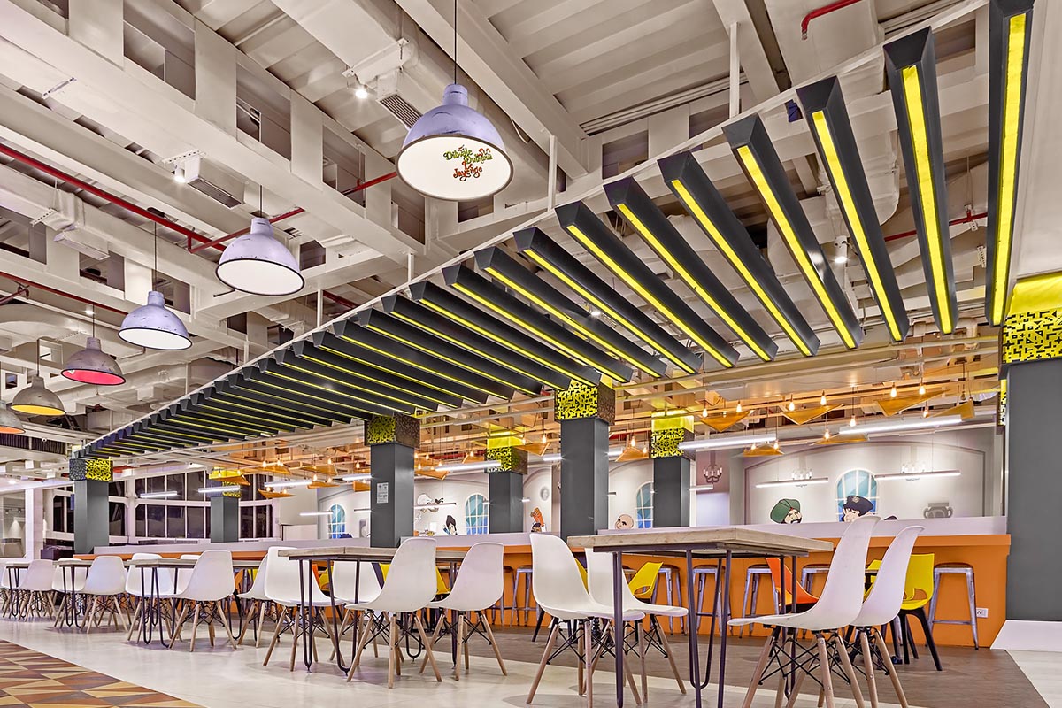
Spread across an area of tight 2100 sq. ft. of space, Daler is designed with the reminiscence and nostalgia of the past memories of celebratory fetes in Northern part of India. The idea was to bring in elements which bring a flashback of memories one might have of the fetes visited during the many festivals in India. The space was envisioned around a layered structure with fierce colours over a few relatable features which bring about cheerful vibes to celebrate life every day.
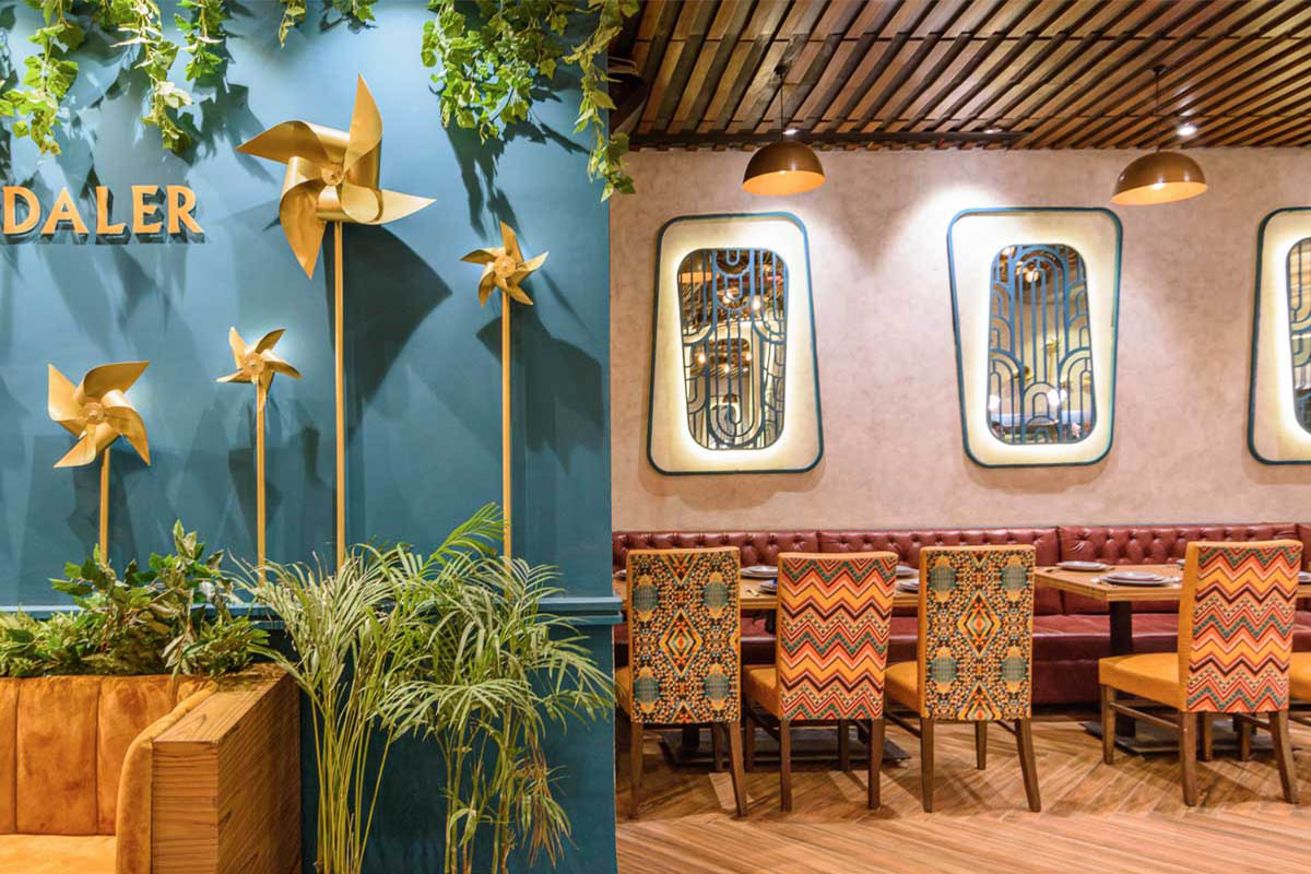
[/vc_column_text][/vc_column][/vc_row][vc_row][vc_column width=”1/2″][vc_single_image image=”16326″ img_size=”large”][/vc_column][vc_column width=”1/2″][vc_single_image image=”16325″ img_size=”large”][/vc_column][/vc_row][vc_row][vc_column][vc_single_image image=”16329″ img_size=”large”][/vc_column][/vc_row][vc_row][vc_column][vc_column_text]The floor plan of the restaurant is segregated in 3 different levels, with each level having its own unique usage. The majority of a-la-carte dining seating is laid out at the first level with a dedicated waiting area. Upon entering, one is welcomed with a kinetic installation of varied sized pinwheels, finished in metallic gold, which forms the backdrop for the indoor branding of the restaurant.
The bar and the buffet is allocated at the second level which becomes centric to the a-la carte area and the private dining space at the third level.[/vc_column_text][/vc_column][/vc_row][vc_row][vc_column][vc_single_image image=”16331″ img_size=”large”][/vc_column][/vc_row][vc_row][vc_column][vc_column_text]The design scheme is aimed at binding all these different activities at different levels within the same space and presenting people with a non-intimidating environment that portrays an inclusive ambience. A material palette was meticulously curated primarily including greys and golds with an obvious introduction of carefully hand-picked tasteful colours to bring about festivity vibes.[/vc_column_text][/vc_column][/vc_row][vc_row][vc_column width=”1/2″][vc_single_image image=”16334″ img_size=”large”][/vc_column][vc_column width=”1/2″][vc_single_image image=”16333″ img_size=”large”][/vc_column][/vc_row][vc_row][vc_column][vc_column_text]The purposeful use of grey concrete finish on the walls with teal as the main accent colour gives a perfect balance to the restaurant which forms the base for our over the top eclectic shaped mirrors.
The floor in black and white makes the interior looks dramatic which adds to the overall look and feel.
The patterns, colours, forms and shapes are used to imbibe a feeling of nostalgia which makes an instant connect between the space and the user.
A lot of mirror has been used in the interiors, be it on the ceiling or on the walls, which, because of the reflections, in a way depicts a happy chaos around and gives a sense of a comprehensive environment.
The ceiling in itself is a ginormous art installation which is an abstract reminiscent of a giant wheel, one of the prime focal points at fetes.[/vc_column_text][/vc_column][/vc_row][vc_row][vc_column][vc_single_image image=”16332″ img_size=”large”][/vc_column][/vc_row][vc_row][vc_column][vc_column_text]Photographer: Satish Kumar.[/vc_column_text][/vc_column][/vc_row][vc_row][vc_column][vc_column_text]PROJECT CREDITS
Interior Design: Design Ethics Architecture Studio
Principal Architects: Poulomi Dhar and Jatin Gupta.[/vc_column_text][/vc_column][/vc_row][vc_row][vc_column][vc_separator border_width=”4″][/vc_column][/vc_row][vc_row][vc_column width=”1/2″][vc_single_image image=”16225″ img_size=”medium”][/vc_column][vc_column width=”1/2″][vc_column_text]check out the above full story in our
DE JAN -FEB 2020 Edition – interior design special.[/vc_column_text][/vc_column][/vc_row]
