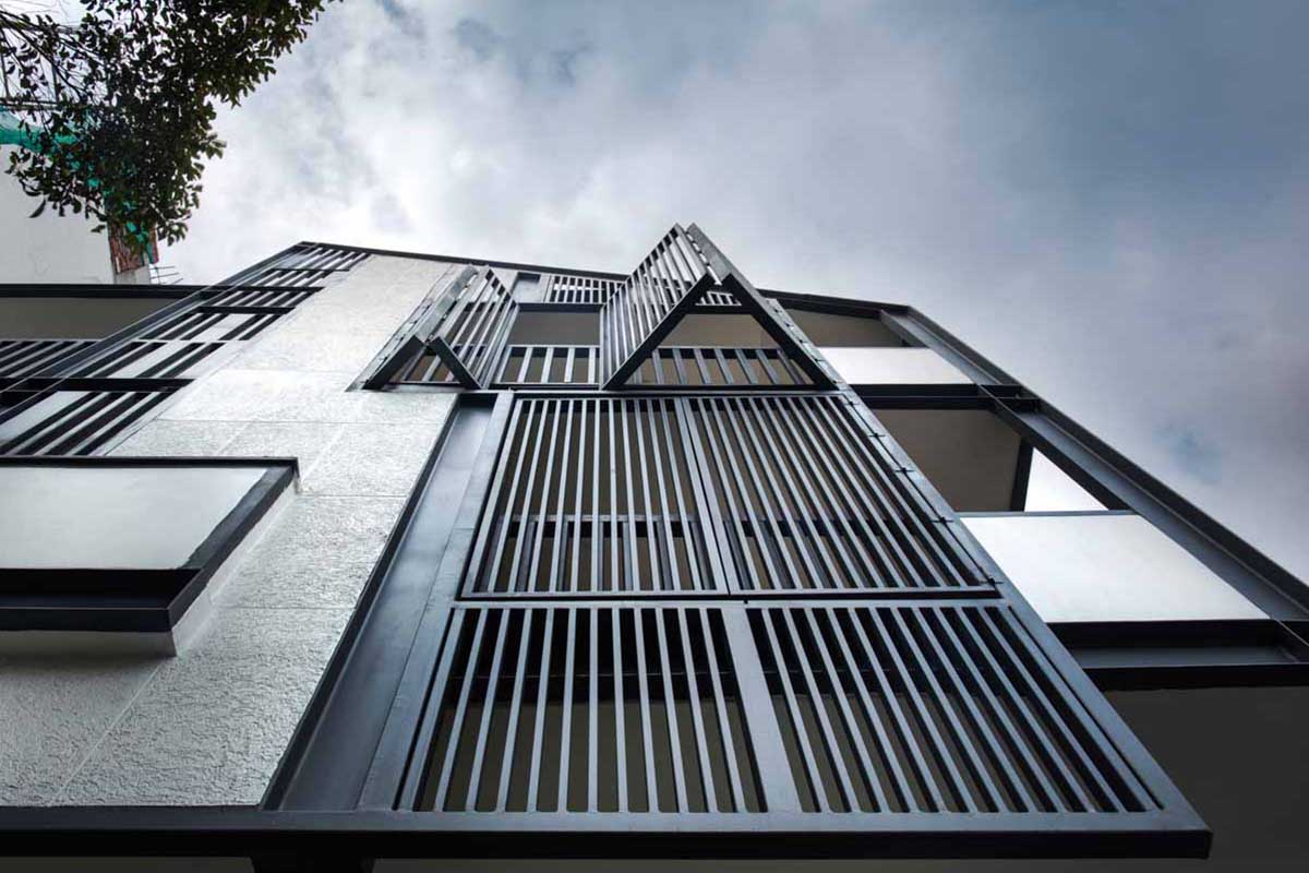
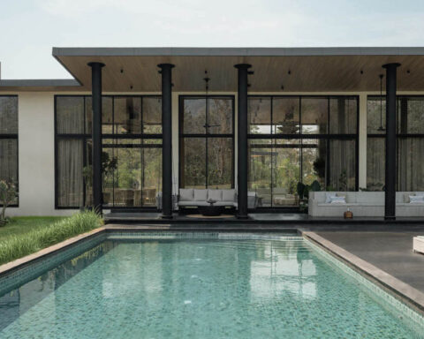
[vc_row][vc_column][vc_custom_heading text=”A vertical fin louvered facade, creates a play of light and shadow in this Gurugram residence.” use_theme_fonts=”yes”][/vc_column][/vc_row][vc_row][vc_column][vc_column_text]Project Name : Casa Hypotenuse
Project Location : Gurgugram, India
Project size : 6,500 sq. ft.
Architects/Designer : Renesa Architecture Design Interiors
Project Status : Built[/vc_column_text][/vc_column][/vc_row][vc_row][vc_column][vc_single_image image=”17446″ img_size=”full”][vc_single_image image=”17447″ img_size=”full”][/vc_column][/vc_row][vc_row][vc_column][vc_column_text]Text description by the Architects.
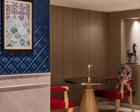
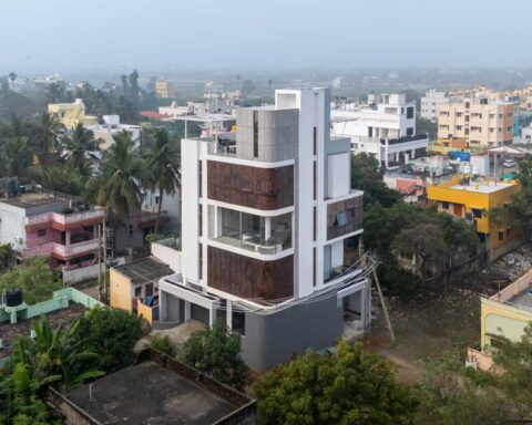
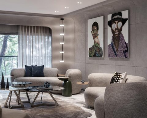
Casa Hypotenuse is a residential dwelling in the middle of the busy Gurgaon Metropolis. Just like any other building, this 20-year-old structure initiated a design investigation and led to an intense structural stability exercise to provide an aesthetic make over. The design, most importantly accounted for the south facing façade which provided a big opportunity to play with and incorporate the harsh sun through diffused lighting in the house, throughout the day. The conceptualisation was such that it added to the different scale and angle, creating a frame that acts like an architectural spectacle on the Gurugram cityscape.[/vc_column_text][/vc_column][/vc_row][vc_row][vc_column][vc_single_image image=”17448″ img_size=”full”][/vc_column][/vc_row][vc_row][vc_column width=”1/2″][vc_single_image image=”17449″ img_size=”full”][/vc_column][vc_column width=”1/2″][vc_single_image image=”17450″ img_size=”full”][/vc_column][/vc_row][vc_row][vc_column][vc_column_text]The Hypotenuse is the shortest path between two faces of an entity which happen to be the two open elevations at the site. The idea of equating both the open south and east elevations results in a 1:1 elevation design sharing principle and tries to communicate a design harmony to the viewers passing through. Thus, the slanted hypotenuse forms the elongated framework around the two open faced facade story of this house made of solid concrete and steel and emphasises on the use of proper utilisation of dilapidated structural massing through the use of the new louvered facade layering hung to the old available mass.[/vc_column_text][/vc_column][/vc_row][vc_row][vc_column width=”1/2″][vc_single_image image=”17454″ img_size=”full”][/vc_column][vc_column width=”1/2″][vc_single_image image=”17453″ img_size=”full”][/vc_column][/vc_row][vc_row][vc_column width=”1/2″][vc_single_image image=”17451″ img_size=”full”][/vc_column][vc_column width=”1/2″][vc_single_image image=”17452″ img_size=”full”][/vc_column][/vc_row][vc_row][vc_column][vc_column_text]The vertical fin louvered elements act as a solar shading device particularly with the sun angle facing the facade throughout the day and creates a striking play of light through the shadow on the walls. In addition to bringing in light, there’s also cross ventilation and a balcony to sit in and relax. The camouflage of the old and new re-creates a path of adaptive reuse, retaining the structural entities and only the architecturally strengthening parts.[/vc_column_text][/vc_column][/vc_row][vc_row][vc_column width=”1/2″][vc_single_image image=”17457″ img_size=”full”][/vc_column][vc_column width=”1/2″][vc_single_image image=”17458″ img_size=”full”][/vc_column][/vc_row][vc_row][vc_column width=”1/2″][vc_single_image image=”17455″ img_size=”full”][/vc_column][vc_column width=”1/2″][vc_single_image image=”17456″ img_size=”full”][/vc_column][/vc_row][vc_row][vc_column][vc_column_text]The Transformation of this old house into an airy and lit habitable residential unit becomes a pedantic act of inserting technically expressive, delicate and lightweight implants of materiality in the form of steel and concrete. Consequently, maintaining the candid sense of nature of the exterior, the interior compliments those tones through beige brown shades that place the clients as the tastemakers. The layout is kept simple, but exaggerated through accessories and the accentuation in home décor products. In accordance with the hypotenuse being shadowed by the greens on the outside, the indoor environment is kept soothing and comfortable with colourful furniture to add vibrancy to the house.[/vc_column_text][/vc_column][/vc_row][vc_row][vc_column][vc_single_image image=”17459″ img_size=”full”][/vc_column][/vc_row][vc_row][vc_column][vc_column_text]The design brings a flavor of quirkiness, but in a subtle way. The main challenge of adaptive reuse is to keep history alive while evolving into a contemporary, comfortable and poetic space. The use of colors and artwork helps the overall narrative and is further supported by the super-imposed neutral color palette. The idea is to compose both the parts- the old and new while they play their honest roles to create an architectural craft out of the mundane Delhi skyline.
A design journey of overlaying a different approach over an existing solid framework can result in some exciting design harmonies. The Journey detaches itself from its true culture and coordinates and fits into a new zone of architecture.[/vc_column_text][/vc_column][/vc_row][vc_row][vc_column width=”1/2″][vc_single_image image=”17462″ img_size=”full” add_caption=”yes”][/vc_column][vc_column width=”1/2″][vc_single_image image=”17463″ img_size=”full”][/vc_column][/vc_row][vc_row][vc_column width=”1/2″][vc_single_image image=”17461″ img_size=”full”][/vc_column][vc_column width=”1/2″][vc_single_image image=”17460″ img_size=”full”][/vc_column][/vc_row][vc_row][vc_column][vc_column_text]Photographer: Niveditaa Gupta.[/vc_column_text][/vc_column][/vc_row][vc_row][vc_column][vc_column_text]PROJECT CREDITS
Architecture: Renesa Architecture Design Interiors, New Delhi.
Principal Architect: Sanjay Arora
Studio Head Architect: Sanchit Arora
Interior Designer/Decor Head: Vandana Arora
Studio Technical Head: Virender Singh
Design Team : Akarsh Varma, Jagdish Bangari, Aayush Misra.
Client – Mr.Romesh Pandita
Contractor – Kamal Chaddha
Lighting Consultant – White Lighting Solutions, India.[/vc_column_text][/vc_column][/vc_row]
