[vc_row][vc_column][vc_custom_heading text=”Cafe Eleven 11 in Ahmedabad by Saniya Kantawala Design shows a lot of drama with play of basic shapes and colours.” use_theme_fonts=”yes”][/vc_column][/vc_row][vc_row][vc_column][vc_column_text]Project Name : Cafe Eleven 11
Project Location : Ahmedabad, Gujarat, India
Project size : 2000 sq. ft
Architects/Designer : Saniya Kantawala Design
Project Status : Built
Website : www.saniyakantawaladesign.com/
Instagram : @saniyakantawaladesign[/vc_column_text][/vc_column][/vc_row][vc_row][vc_column][vc_single_image image=”15768″ img_size=”large”][/vc_column][/vc_row][vc_row][vc_column][vc_column_text]
Eleven 11 derives the label from the design scheme it follows, portraying dual possibilities of the same elements in a space, such that the interpretation of the interior retains its character and essence. The restaurant-café has been established with unique seating spaces evolving into an engaging space. The idea has been kept very elementary, the space adorned with a play of basic shapes and colours. A lot of drama can be seen due to this.
[/vc_column_text][/vc_column][/vc_row][vc_row][vc_column width=”1/2″][vc_single_image image=”15769″ img_size=”large”][/vc_column][vc_column width=”1/2″][vc_single_image image=”15770″ img_size=”large”][/vc_column][/vc_row][vc_row][vc_column][vc_column_text]
The entry is at a point in the restaurant where the guests stand facing a horizontal division of the space, imbued with a spectacular use of colour. It exposes the exciting elements of design, furniture and seating styles to the guests. The flow of movement seamlessly directs the guests to the right, towards the counter and the mocktail bar area. Moving ahead of the counter, an upheaval of the space animates the ambience with delirium, imitating the 90’s American diners. To the left of the entrance, the restaurant fashions a booth seating, a long table along with bar height wooden chairs and also a three-level amphitheatre-styled step seating. The latter, with its pop-up cushions and a polished wooden finish, adds abundantly to the dynamics of the spatial design.
[/vc_column_text][/vc_column][/vc_row][vc_row][vc_column][vc_single_image image=”15783″ img_size=”large”][/vc_column][/vc_row][vc_row][vc_column][vc_column_text]
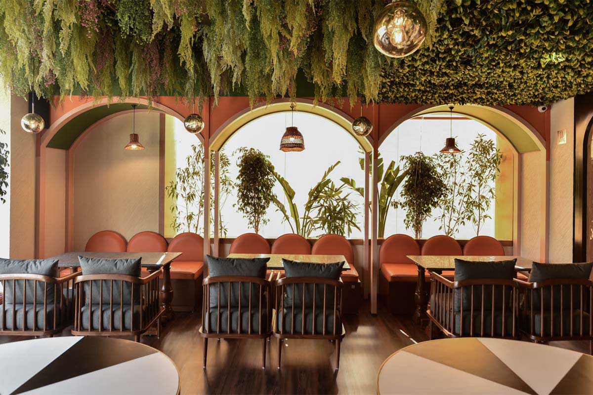
Further, to the left in the space, an observer would find a wooden partition of the volume with glazed capsule-shaped cut-outs. The partition modules are reproduced in six, three for each colour division. On the other side of the partition is another seating area, secluded, with wide windows on two sides allowing ample daylight, if need be. This space has been specially crafted for patrons to relax and unwind, with plush seating and impressive rich teak wood used for table legs. It has been influenced by the alfresco style of European cities. To make it coherent, the space is embellished with plenty of planters, hanging from the ceiling and others around the windows. The complete interior instils a certain style and degree of symmetry evident throughout the volume.
[/vc_column_text][/vc_column][/vc_row][vc_row][vc_column][vc_single_image image=”15771″ img_size=”large”][/vc_column][/vc_row][vc_row][vc_column][vc_column_text]
Working around the theme of divide, the materials like ply and pine veneers-hardwood, posed a challenge to constitute perfect vertical symmetry. The furniture layout facilitated this as evident in the seating spaces thereabouts of the entrance. The bar is divided with handcrafted wooden carved ply and veneer planks. One observes a bold divide in the tables placed in the centre as they have both these finishes on them, in terms of colour scheme.
Left half of this section is carved out of the hardwoods in the warm wooden organic shades and the other half is finished with the calm dewy shades of lavender, the key hue, where the visitor steps in first. An unconventional choice, lavender presented an opportunity to blend the hues of purple, such as bluebells, lilacs and a smooth serene shade for one of the walls.
[/vc_column_text][/vc_column][/vc_row][vc_row][vc_column][vc_single_image image=”15772″ img_size=”large”][/vc_column][/vc_row][vc_row][vc_column][vc_column_text]
In the dining space, at the rear right of the entrance, these hues coalesce on the walls in the eclectic interior. The colour palette of the space has tables cladded with natural white Carrara marble to balance and retain visual harmony. This part of the flooring has been spruced up with tiny black geometric patterned white tiles. The same tiles can be seen to continue over the bar counter along with wooden colour tiles of the same pattern. This seamlessly establishes the overall concept of the restaurant-café.
The partitioned area in the extreme left, besides the seating style, is reimagined with a unique character introducing a laid-back, chic furnishing and a relaxed aura. A vibrant colour palette has been chosen for this space. With shades of orange and yellow PU fabric for couches,
organic shades of weaved-cane chairs and a couple of circular tables too-divided diametrically into white and black, lending it character. Dark wooden textured flooring and the cool green shade of the planters hanging from above provide the necessary depth and bring overall harmony into the space.
[/vc_column_text][/vc_column][/vc_row][vc_row][vc_column width=”1/2″][vc_single_image image=”15773″ img_size=”large”][/vc_column][vc_column width=”1/2″][vc_single_image image=”15774″ img_size=”large”][/vc_column][/vc_row][vc_row][vc_column][vc_column_text]
The fabrics have been divided into different shades, merging with the walls to impart a cohesive ambience. The HVAC services have been beautifully camouflaged in the bar area with weaved-cane coverings and other areas with the respective colours of the wall. The strong concept of ‘divide’ is seen throughout this space excluding the alfresco area.
[/vc_column_text][/vc_column][/vc_row][vc_row][vc_column width=”1/2″][vc_single_image image=”15779″ img_size=”large”][vc_single_image image=”15775″ img_size=”large”][/vc_column][vc_column width=”1/2″][vc_single_image image=”15776″ img_size=”large”][vc_single_image image=”15782″ img_size=”large”][/vc_column][/vc_row][vc_row][vc_column][vc_column_text]
Eleven 11 has different kinds of seating throughout the space, it is pleasant, vibrant and warm. The addition of a convivial amphitheatre-styled step seating with plug points for every seat so that students and professionals can work out of a casual cosy little area on their devices. Above the stepped-seating, there are beautiful blown glass drop lights hanging, minimalist in design, while, the bar counter is decked with artistically laid-out globular white tinted luminaries. With the geometric patterns, fabric textures and majorly with the use of colours, the restaurant-café at the first instance projects visual divisions. Oxymoronic may it sound, but, with the movement and experience of the space, the divisions, progressively, of all sorts find their harmony in the contrast. This broadly serves the design intent and profoundly creates the imagery of cohesion of all the elements of design into the space—‘dividing to unite’.
[/vc_column_text][/vc_column][/vc_row][vc_row][vc_column width=”1/2″][vc_single_image image=”15777″ img_size=”large”][/vc_column][vc_column width=”1/2″][vc_single_image image=”15778″ img_size=”large”][/vc_column][/vc_row][vc_row][vc_column][vc_column_text]Photographer: Vivek Shah and Karan Khosla.[/vc_column_text][/vc_column][/vc_row][vc_row][vc_column][vc_column_text]PROJECT CREDITS
Interior Design: Saniya Kantawala Design
Principal Design: Saniya Kantawala[/vc_column_text][/vc_column][/vc_row]
