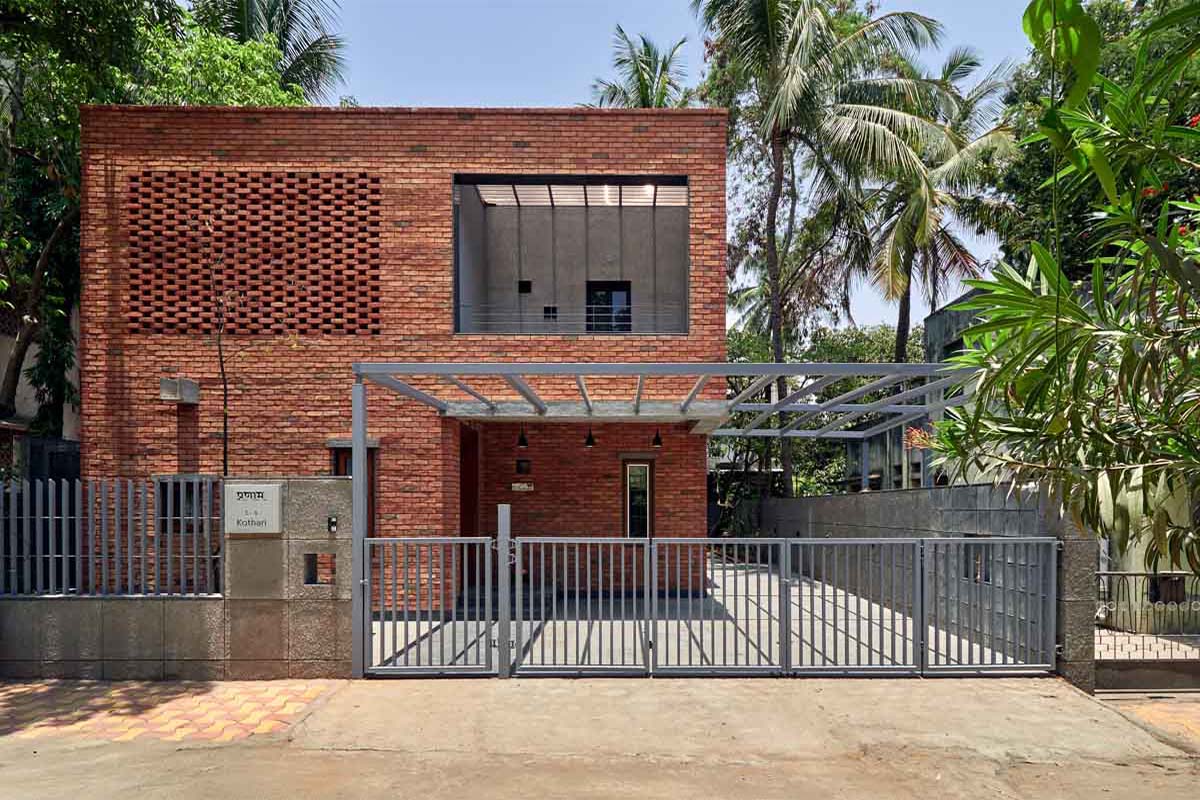
[vc_row][vc_column][vc_custom_heading text=”Alok Kothari Architects, Pune design this elegant yet subtle brick facade house with brick jaali’s, providing a traditional earthy character.” use_theme_fonts=”yes”][/vc_column][/vc_row][vc_row][vc_column][vc_column_text]Project Name : The Brick Abode
Project Location : Pune, Maharashtra, India
Project size : 3600 sq. ft. plot
Architects/Designer : Alok Kothari Architects
Project Status : Built
Website : www.alokkothari.com/
Instagram : @alokkothariarchitects[/vc_column_text][/vc_column][/vc_row][vc_row][vc_column][vc_single_image image=”15593″ img_size=”large”][/vc_column][/vc_row][vc_row][vc_column][vc_column_text]Text description by the architects.
Nestled in a quiet residential neighborhood of Pune, this 3,600 sq.ft. site hosted a 25-year-old single storey house. Unfortunately, we decided to bring down this structure as it was in a dilapidated state, its interiors were gloomy & also, it wasn’t a vaastushastra (traditional Hindu science of architecture) compliant house – which was the client’s main requirement.[/vc_column_text][/vc_column][/vc_row][vc_row][vc_column width=”1/2″][vc_single_image image=”15594″ img_size=”large”][/vc_column][vc_column width=”1/2″][vc_single_image image=”15595″ img_size=”large”][/vc_column][/vc_row][vc_row][vc_column][vc_column_text]Study of the site surroundings & the existing structure showed that the main reasons for the existing house being dull & dark were the parking+3 storey bungalow on the east side of the site that was cutting off the morning sun & small opening sizes which didn’t allow enough light to penetrate into the house. In order to cater to this issue, we decided to anchor all the spaces in the new design to a central ‘sky light’ which would not only draw in light during the entire day but also act as a ‘brahmasthan’ (an important aspect related to vaastushastra) of the house. Also, having large windows to all the rooms was the logical way forward.[/vc_column_text][/vc_column][/vc_row][vc_row][vc_column width=”1/2″][vc_single_image image=”15596″ img_size=”large”][vc_single_image image=”15603″ img_size=”large”][/vc_column][vc_column width=”1/2″][vc_single_image image=”15602″ img_size=”large”][vc_single_image image=”15597″ img_size=”large”][/vc_column][/vc_row][vc_row][vc_column][vc_column_text]Along with the norms of vaastushastra, the larger planning principle used was to divide the house into 2 functional zones – one for the private spaces & the other for the public spaces – along the north-south axis. The client’s demand of having all the daily necessity spaces – living, dining, kitchen, pooja room (area dedicated to worship to God), 2 bedrooms & toilets – on the ground floor was also catered to. The living & the kitchen were placed on either side of the central ‘sky light’, below which the magnet of the entire house was placed – the dining area. The positioning of an L-type, folded plate, ferrocrete staircase around the dining added a play to this central core. The living extends onto the outdoor seating area which hosts a traditional Indian swing that the client had bought from Rajasthan. The kitchen is connected to the utility space at the rear side (south side) of the house.
Continuing the same grid, the first floor is composed of 2 bedrooms, toilets & a multi-purpose room. Carving out a block from the ground floor grid, provision was made for 2 car parks next to the entry porch.[/vc_column_text][/vc_column][/vc_row][vc_row][vc_column width=”1/2″][vc_single_image image=”15598″ img_size=”large”][vc_single_image image=”15599″ img_size=”large”][/vc_column][vc_column width=”1/2″][vc_single_image image=”15600″ img_size=”large”][vc_single_image image=”15601″ img_size=”large”][/vc_column][/vc_row][vc_row][vc_column][vc_column_text]The client wanted a house that was simple but still makes a statement. We took this up as a challenge & started exploring different ways of architectural expression. Our research took us to the traditional residential typology of Pune – the wada – which was always as simple & elegant and was mostly constructed in exposed brick or basalt stone or both. We decided to use brick as it is a reasonable material from environment as well as cost perspective. Moreover, the warmth & the aesthetics provided by brick as a material is unmatched.[/vc_column_text][/vc_column][/vc_row][vc_row][vc_column width=”1/2″][vc_single_image image=”15605″ img_size=”large”][/vc_column][vc_column width=”1/2″][vc_single_image image=”15604″ img_size=”large”][/vc_column][/vc_row][vc_row][vc_column][vc_column_text]Massing of the structure has been kept very subtle & focus has been put on highlighting the materiality of brick. To complement the red colour of the bricks, exposed concrete box windows & weather shades have been introduced. Also, the square grid of rough cement finish plaster on the compound wall accentuates the presence of bricks. In order to break the monotony of the brick façade & also to provide privacy, ‘jaali’ (perforated wall in brick) work has been used.
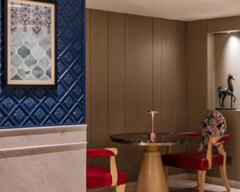
While the material palette (brick & concrete) for the exteriors of the building is carefully chosen to give it a simple, natural & a playful look; the interiors also follow a similar approach. The material palette comprising of teakwood finish & light colours helps in providing a neat, clean & a spacious ambience.[/vc_column_text][/vc_column][/vc_row][vc_row][vc_column][vc_single_image image=”15606″ img_size=”large”][/vc_column][/vc_row][vc_row][vc_column][vc_column_text]The main USP of the interior design is the use of ‘patterns’ in defining different spaces. The seed of this once again lies in our study of the traditional Indian architecture where the use of such patterns is evident in floorings, wall carvings, ceilings, etc. According to vaastushastra the use of such shapes & patterns boosts the energy flow & generates positive vibrations. These positive vibrations are what transform a house into ‘a home’ – an abode.[/vc_column_text][/vc_column][/vc_row][vc_row][vc_column][vc_single_image image=”15607″ img_size=”large”][/vc_column][/vc_row][vc_row][vc_column][vc_column_text]Photographer: Hemant Patil.[/vc_column_text][/vc_column][/vc_row][vc_row][vc_column][vc_column_text]PROJECT CREDITS
Architecture/Interior Design: Alok Kothari Architects
Design team: Alok Kothari, Devendra Deshpande, Akshay Karanjkar
Structural Consultants: Spectrum Consultants[/vc_column_text][/vc_column][/vc_row]
