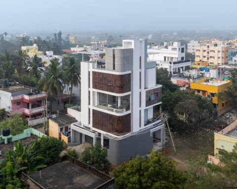
House no. 12, an idyllic space amidst the urban chaos in Mumbai by Quirk Studio.
Project Name : House No. 12
Project Location : Mumbai, India
Project size : 2400 sq. ft.
Architects/Designer : Quirk Studio
Project Status : Built
Text description by the architects.
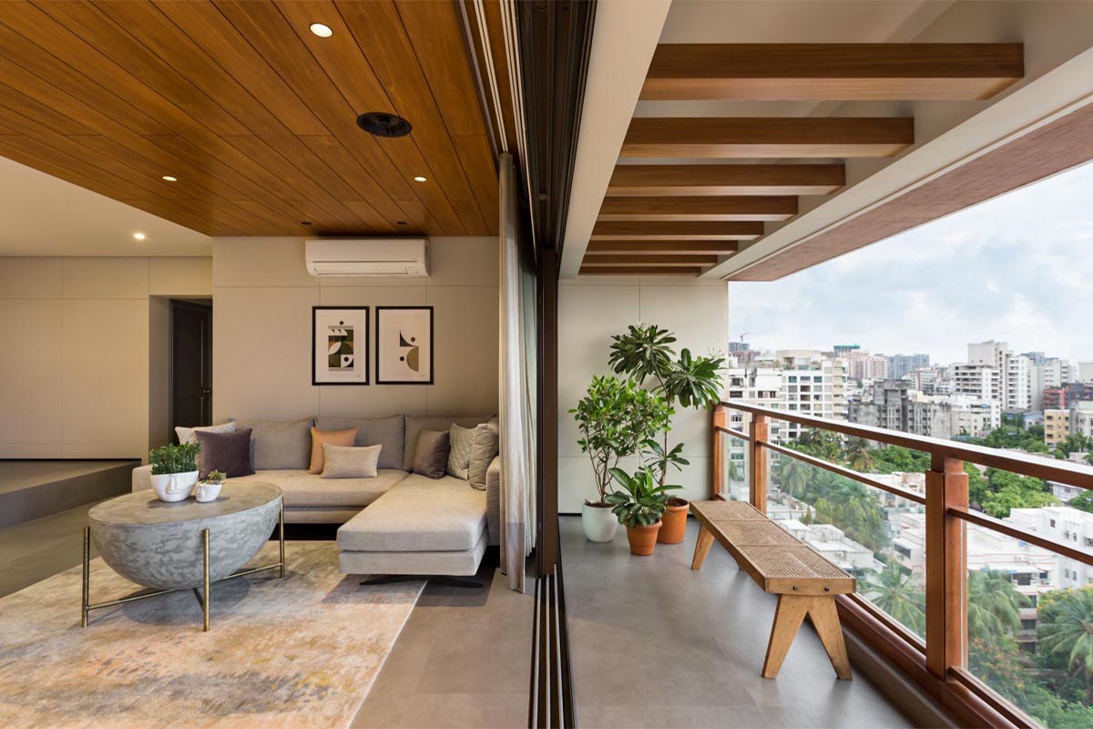
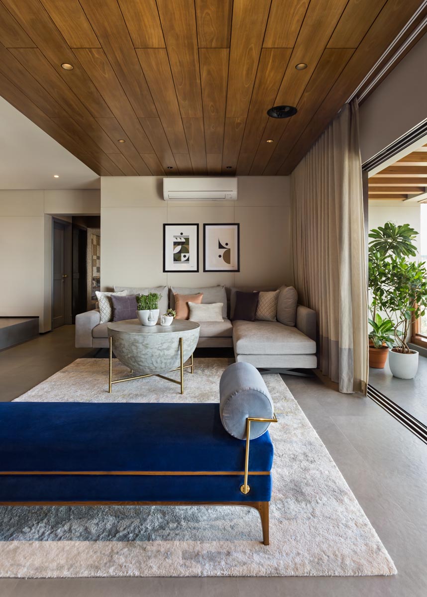
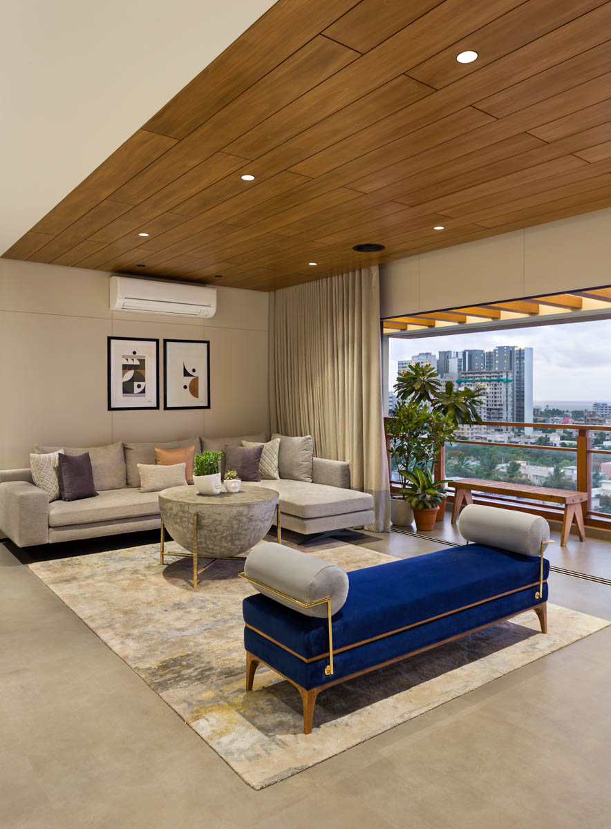
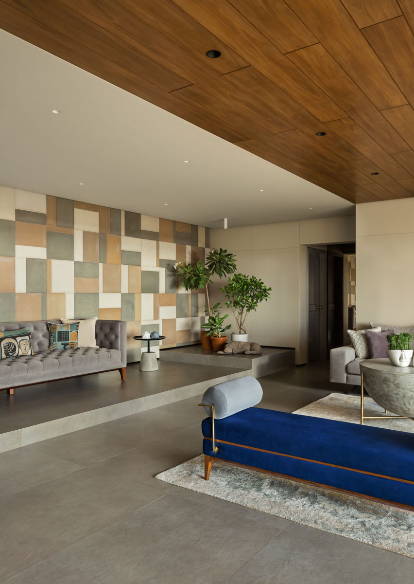
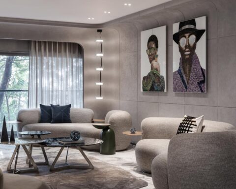
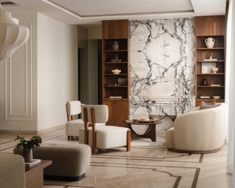
The design brief from the client was to create a home that is suited for a young couple in their early 30’s with a toddler. The aim was to create a space that had a classic, contemporary and modern aesthetic, but at the same time, exude fun, colour & eclectic elements through art, accessories, accent furniture and lights. Keeping in mind the design brief as well as the personality, the designers decided to keep the shell of the home neutral and monochromatic in terms of floor and wall finishes, to add an element of layering to the space. Grey ceramic tiles have been used through the living, dining and kitchen, while the walls are finished with everest board paneling and in a deeper tone of beige with a metal shadow groove running all across. A certain warmth has been added to the main living area by doing a wooden finished ceiling.
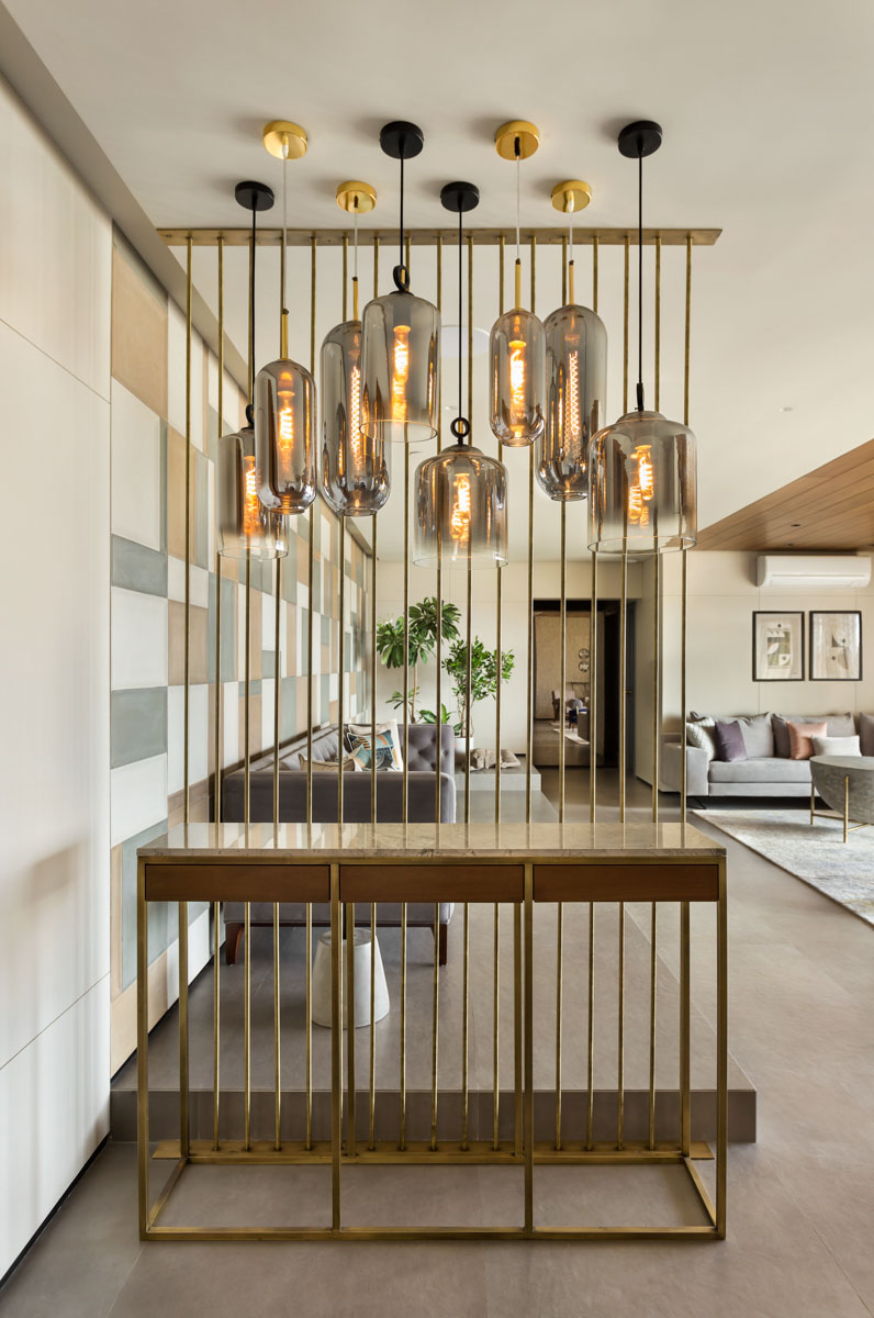
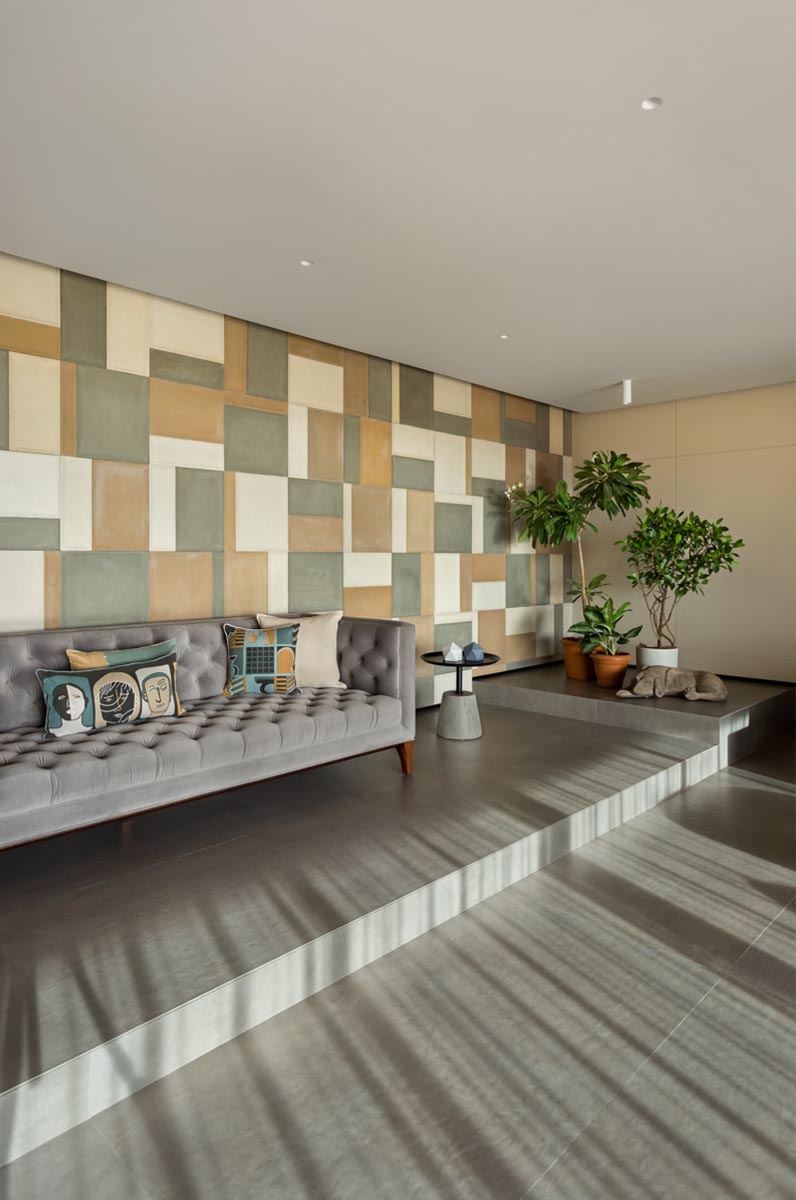
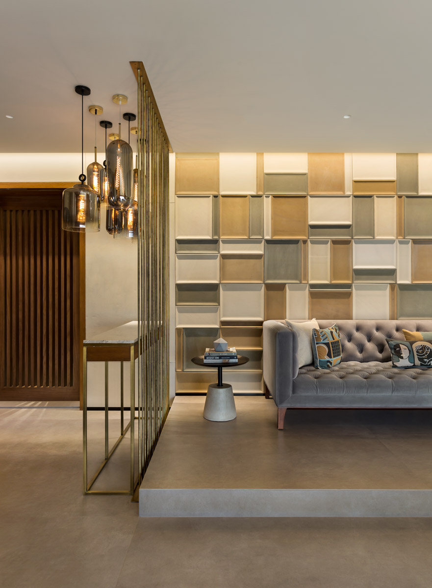
A customised marble console and an antique brass pipe screen with a cluster of grey, tinted glass pendant lights, is placed in front to build a strong first impact, while creating an entrance foyer. Further transitioning into the living room, there are three seating areas, which despite being in three different corners, are in perfect harmony with the space. To differentiate between the seating areas, an elevation has been added to the left side of the home, which boasts of a wall crafted out of 3-dimensional handmade tiles from World of Stones that is highlighted with a special focus light that creates a feature wall, creating shadows and plays with colour around it. The main seating is hinged by a customised concrete finished dome coffee table and comfortable armchairs from Phantom Hands.
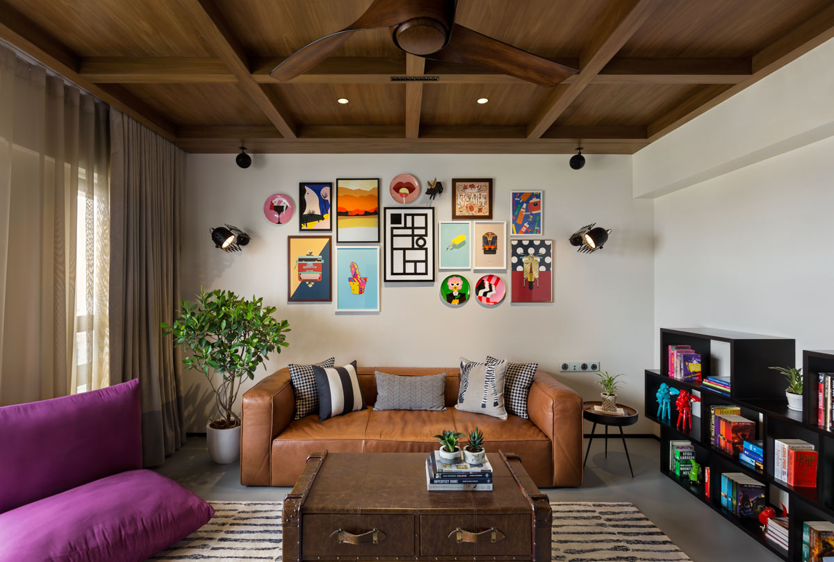
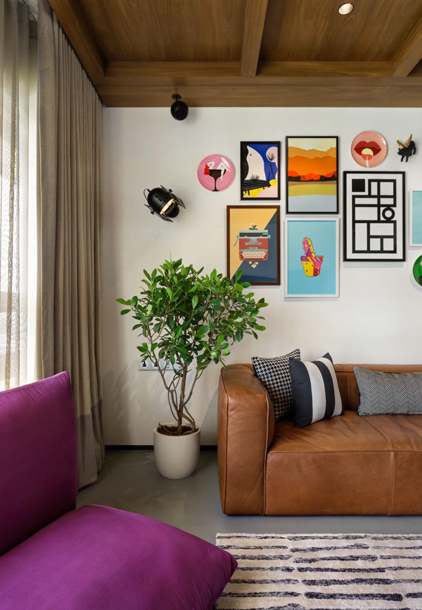
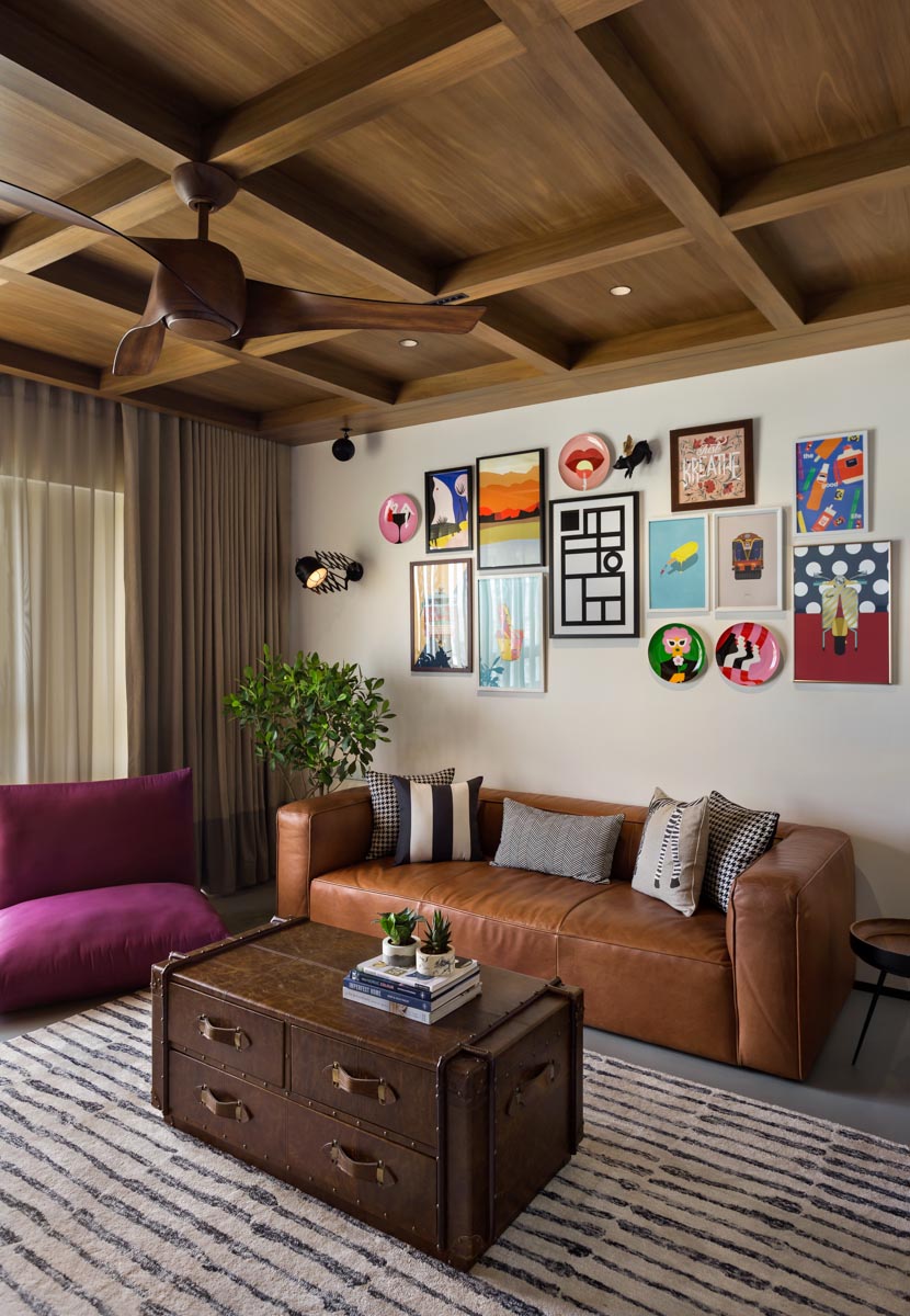
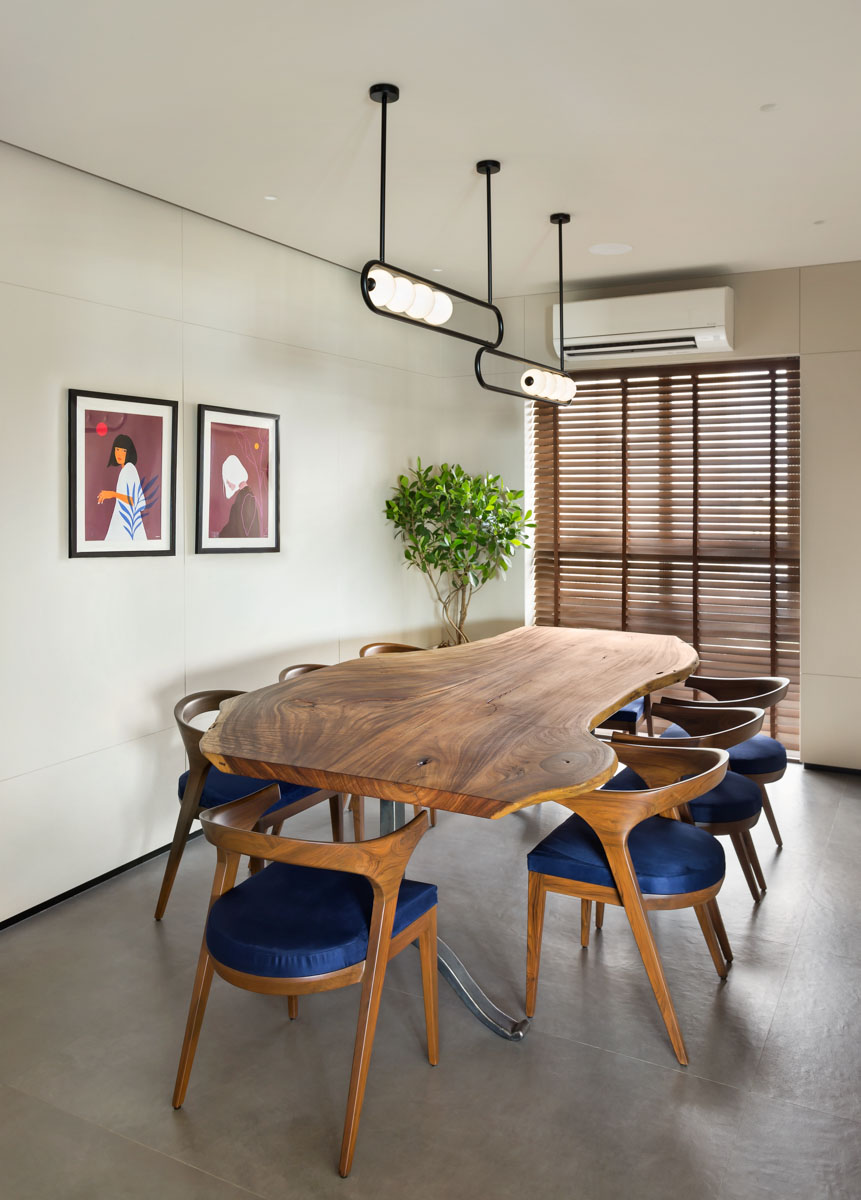
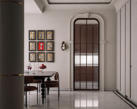
The living room spills into the dining area, where the space has been kept minimal, giving spotlight to the live edge wood dining table from ‘and so’ and the modern chandelier by Arjun Rathi. The den is the space which really reflects the personalities of the homeowners, and therefore, the designers have created a neutral shell using a solid grey epoxy flooring and a wooden panelled ceiling. The colour and pop to the space is added by means of furniture, books, accessories and an eclectic art wall.
In order to push the envelope in terms of design, the powder room has been accentuated as an element with a dramatic, dimly lit mood that is enhanced by the vintage floral wallpaper by Nilaya and finished in antique mirror with a custom-made brass under-counter table with a wooden top and a circular brass suspended mirror.
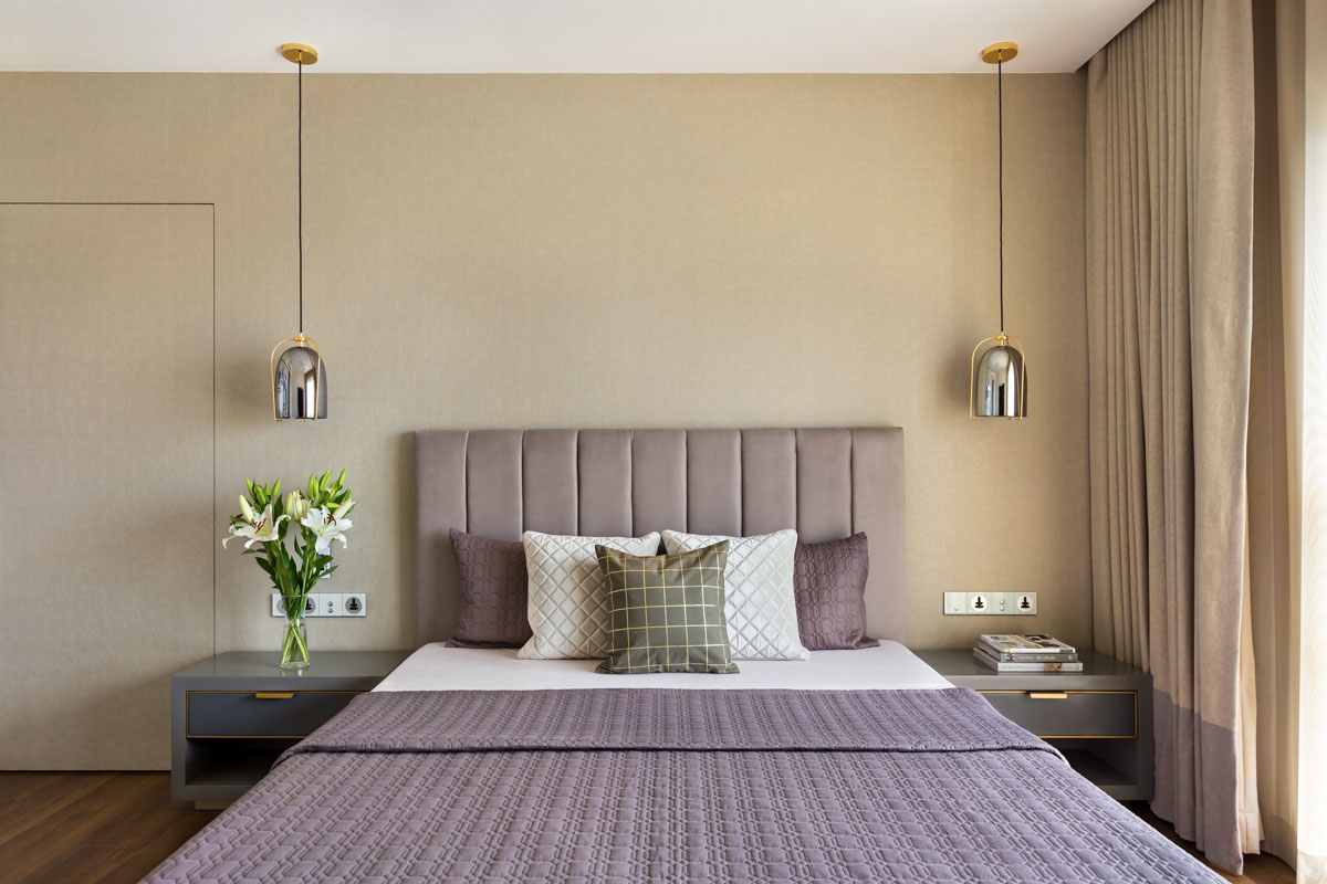
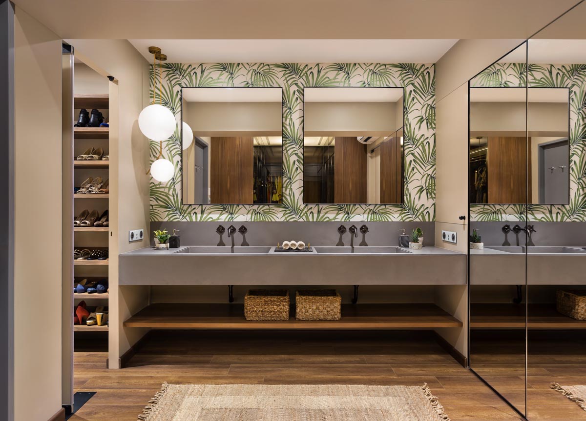
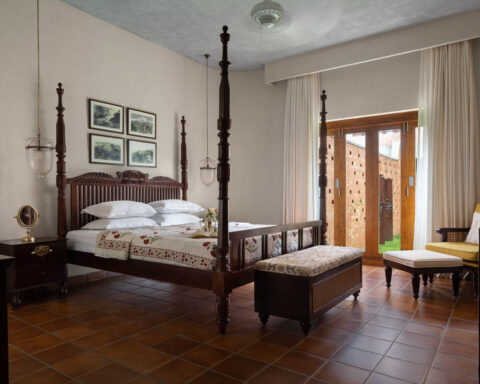
The master bedroom is designed to be simple and neutral, with a wallpaper on the wall behind the bed, and a wall dedicated to photographs on one side. The room opens into the walk-in wardrobe, shoe closet and the master bathroom. The ‘his and her’ sink is crafted from a river-washed Kalinga stone and the wall behind the mirrors is finished in a nature inspired patterned leaf wallpaper to add a pop of colour to the entire space. The master bathroom is fully finished in Sonata Grey Marble with a modern groove detail.
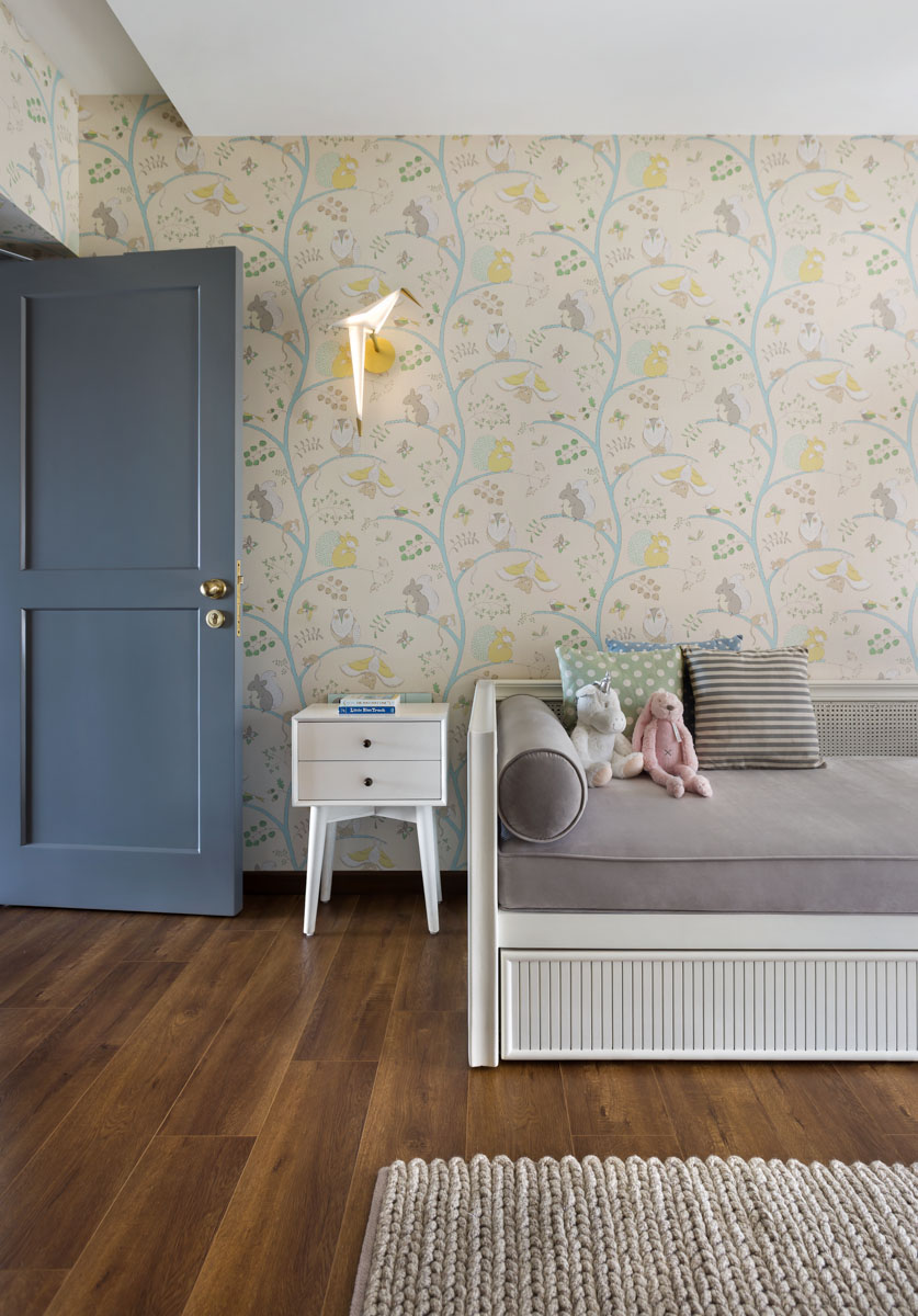
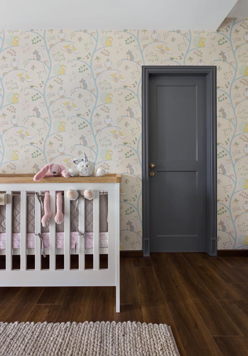
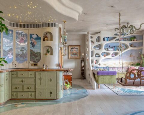
The nursery, despite being created for a baby girl, has been done in very neutral colours of greys, yellows and green, through a wallpaper that exudes a gentle warmth and has a very cute aesthetic to it and a custom daybed in white PU. The walk-in wardrobe of the nursery is finished in white back-painted glass shutters and PU shutters with pastel coloured wooden knobs. The bathroom for this space is completely finished in Volakas marble with a statement bath vanity counter.
The entire space is enhanced with green plants to add warmth and pops of colour throughout the expanse of the residence.
Photographer: Kunal Bhatia.
Check out the above full story in our DE JAN -FEB 2020 Edition – interior design special.


