[vc_row][vc_column][vc_custom_heading text=”New Delhi based Studio Bipolar designs this workspace inspired by the waves of DNA strands. ” use_theme_fonts=”yes”][/vc_column][/vc_row][vc_row][vc_column][vc_column_text]Project Name : Brick Helix
Project Location : New Delhi, India
Project size : 4500 sq. ft
Architects/Designer : Studio Bipolar
Project Status : Built
Website : www.studiobipolar.in/
Instagram : @studio_bipolar[/vc_column_text][/vc_column][/vc_row][vc_row][vc_column][vc_single_image image=”15948″ img_size=”large”][/vc_column][/vc_row][vc_row][vc_column][vc_column_text]New Delhi based architecture and interior design firm, Studio Bipolar designs this workspace inspired by the waves of DNA strands.[/vc_column_text][/vc_column][/vc_row][vc_row][vc_column][vc_column_text]Text description by the Architects.
The clients brief was to design a space for its work force that endeavoured to include every person, whether scientist or sales staff, in the company’s values and missions. They wanted the subject of their work, DNA, to be the starting point for the design concept.
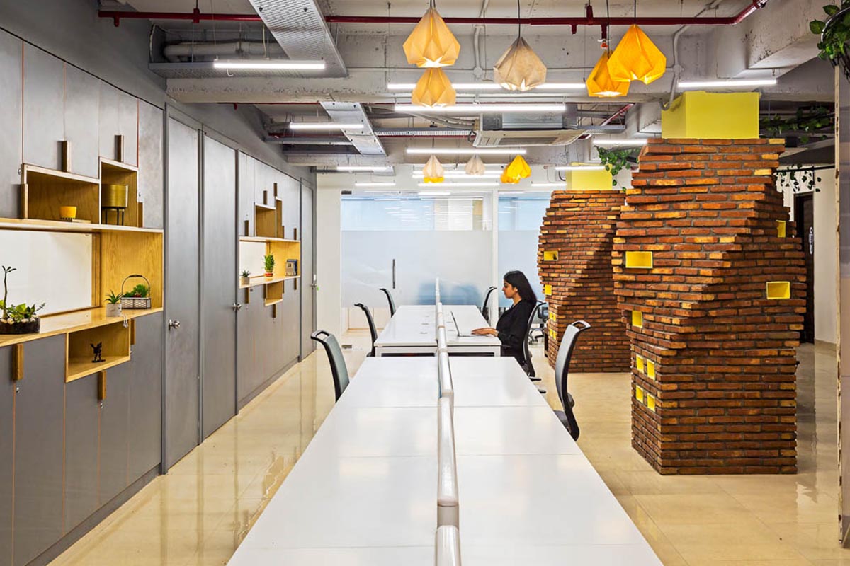
We decided to approach the space by deconstructing it into smaller blocks. Programmatically, the space can be divided into broad categories; lab rooms, executive areas, open work area, brainstorming areas, cafeteria and meetings rooms.
The overall concept was to create a bright, cheerful and ‘organic, natural feel’ to the entire space.[/vc_column_text][/vc_column][/vc_row][vc_row][vc_column][vc_single_image image=”15949″ img_size=”large”][/vc_column][/vc_row][vc_row][vc_column][vc_column_text]We conceived of using the basic building block of construction, a brick, as a metaphor for the building blocks of life. We clad the existing columns in rotating circles of brick, to resemble the helical nature of a strand of DNA. The yellow boxes left inside are functional, they are used to store sales brochures. In the conference room, we laid bricks in various ways to resemble the waves of DNA strands.[/vc_column_text][/vc_column][/vc_row][vc_row][vc_column][vc_single_image image=”15950″ img_size=”large”][/vc_column][/vc_row][vc_row][vc_column][vc_column_text]The bulk of the workforce sits in the open seating area in the midst of the brick helixes. The labs and the main workspace are separated by a storage wall with windows. These custom made storages are made like interlocking cells coming together to form a wall. The long windows in each lab, allow some visual connectivity between the main office and private labs , and makes the space more inclusive.[/vc_column_text][/vc_column][/vc_row][vc_row][vc_column][vc_single_image image=”15953″ img_size=”large”][vc_single_image image=”15954″ img_size=”large”][/vc_column][/vc_row][vc_row][vc_column][vc_column_text]In the main breakout area, we gave a curving metal track suspended, from above, winding around the columns. Sliding whiteboards are suspended from these which help in brainstorming sessions for the work force. The metal track curves into the cafeteria which acts as a deconstructed garden.
With pine wood slats above, glass orb pendants hanging from the track, the cafeteria is a lively space for the young staff of the company to congregate for lunch. The walls on the sides are clad in grass, and serves as a wall of fame for the staffers.[/vc_column_text][/vc_column][/vc_row][vc_row][vc_column width=”1/2″][vc_single_image image=”15955″ img_size=”large”][/vc_column][vc_column width=”1/2″][vc_single_image image=”15956″ img_size=”large”][/vc_column][/vc_row][vc_row][vc_column][vc_column_text]The overall space is bright, colorful and youthful with pops of greenery everywhere. It’s a huge break from the run of the mill corporate offices where, the workforce is separated into cubicles from the get go. This office encourages open conversation and collaboration across teams and is playing a large role in creating a new work culture for the company and its team.[/vc_column_text][/vc_column][/vc_row][vc_row][vc_column width=”1/2″][vc_single_image image=”15951″ img_size=”large”][/vc_column][vc_column width=”1/2″][vc_single_image image=”15952″ img_size=”large”][/vc_column][/vc_row][vc_row][vc_column width=”1/2″][vc_single_image image=”15959″ img_size=”large”][/vc_column][vc_column width=”1/2″][vc_single_image image=”15960″ img_size=”large”][/vc_column][/vc_row][vc_row][vc_column][vc_column_text]Photographer: Suryan//Dang.[/vc_column_text][/vc_column][/vc_row][vc_row][vc_column][vc_column_text]PROJECT CREDITS
Interior Design: Studio Bipolar
Lead Architects: Sanjana Mathur, Ujjwal Sagar, Sehaj Brar[/vc_column_text][/vc_column][/vc_row]
