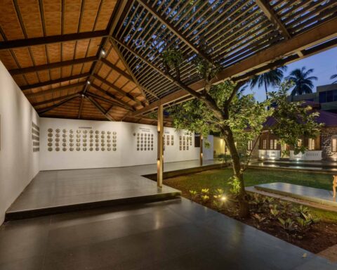
[vc_row][vc_column][vc_custom_heading text=”This residence marks a tribute to the 70s Indian modernism by New Delhi based studio Architecture Discipline.” use_theme_fonts=”yes”][/vc_column][/vc_row][vc_row][vc_column][vc_column_text]Project Name : B 23 Residence
Project Location : New Delhi, India
Project size : 2000 sq. yd. plot
Architects/Designer : Architecture Discipline
Project Status : Built
Website : www.architecturediscipline.com/
Instagram : @architecture_discipline[/vc_column_text][/vc_column][/vc_row][vc_row][vc_column][vc_column_text]text description by the architects.
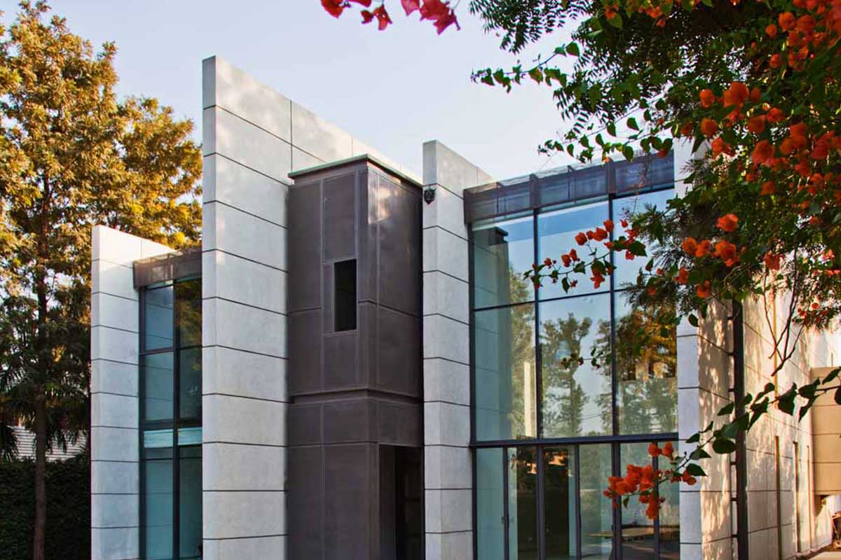
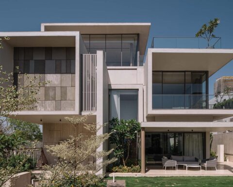
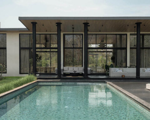
If meaningful design is about the essence of things and eventually about reduction, this bungalow is a distinctive statement on a 2000 square yard’s block. This house typically stands as a tribute to the 70s Indian modernism and is a masterpiece because of its exemplary style and beauty.[/vc_column_text][/vc_column][/vc_row][vc_row][vc_column width=”1/2″][vc_single_image image=”15745″ img_size=”large”][/vc_column][vc_column width=”1/2″][vc_single_image image=”15747″ img_size=”large”][/vc_column][/vc_row][vc_row][vc_column][vc_column_text]It is an extremely interactive home for a close knit joint family, the one that cooks & dines together. The architecture of this house is such that the space embraces their roots and is progressive at the same time. The experience in plan & section is that of an open space, but, that space has been planned in a way that it is interactive yet offers privacy.
The components at site are completely acquired from or around the area and nothing has been pre-fabricated. All the work is presented according to the need and preference and in its very embryonic form, except for the furniture that has been exceptionally designed. Very few factory bought components have been used in this building.[/vc_column_text][/vc_column][/vc_row][vc_row][vc_column width=”1/2″][vc_single_image image=”15749″ img_size=”large”][/vc_column][vc_column width=”1/2″][vc_single_image image=”15748″ img_size=”large”][/vc_column][/vc_row][vc_row][vc_column][vc_column_text]In the name of style, the basic important needs have not been compromised with. The house uses a heat reflective glass, and the stone used was primarily developed first hand; then tried in the market and was applied on site. The washed stone aggregate on the exterior walls is a thermocouple fixed to a cavity wall, this was cast in-situ & is a very effective insulator. Lots of skylights at calculated angles bring in natural light, to color the space orange in the mornings & evenings.[/vc_column_text][/vc_column][/vc_row][vc_row][vc_column width=”1/2″][vc_single_image image=”15751″ img_size=”large”][/vc_column][vc_column width=”1/2″][vc_single_image image=”15750″ img_size=”large”][/vc_column][/vc_row][vc_row][vc_column][vc_column_text]In the living area, the staircase terminates at the first floor to open that level completely. The study overlooks the dining area but the masonry parapet gives privacy. At the other end a traditional railing/balustrade under a sloping roof forces interaction. The floor and walls are white mosaic with crushed shells for a velvet sheen. The stone is cast in situ mosaic which was prepared by using crushed Mother Of Pearl extracted from oysters, collected from local vendors. The house also enthrals with its waste wood flooring that is environment friendly and aesthetic.
The furniture is made up of modular magnetic components, completely reconfigurable and flexible which allows the possibility of change in colour configurations and arrangement. The mats are strikingly alluring which add a playful touch to whole decor. It came as an inspiration from a Thai floor cushions.[/vc_column_text][/vc_column][/vc_row][vc_row][vc_column width=”1/2″][vc_single_image image=”15753″ img_size=”large”][/vc_column][vc_column width=”1/2″][vc_single_image image=”15754″ img_size=”large”][/vc_column][/vc_row][vc_row][vc_column][vc_column_text]We realised the need for flexibility and re-densification of furniture at residences. For a formal living space which needs to accommodate many more people during festive occasions, also you may to choose to use your living space in different ways so we designed this in a manner so that aesthetic feel of the house can be unified but yet tweaked for colour distribution and arrangement. In terms of construction, every half cylinder is a module, as are the triangular extrusions that form back rests and cushions. Modules are unified on another level on perforated steel plates.[/vc_column_text][/vc_column][/vc_row][vc_row][vc_column width=”1/2″][vc_single_image image=”15759″ img_size=”large”][/vc_column][vc_column width=”1/2″][vc_single_image image=”15760″ img_size=”large”][/vc_column][/vc_row][vc_row][vc_column][vc_column_text]These are held down on painted timber platforms. The magnets are embedded within the platforms. These are fairly strong and don’t shift by the weight of human beings. You need a twisting motion to move the modules. The modular coffee tables are cuboids of varying heights and different finishes. They serve different functions like a wine rack, a magazine store, a poof. These can also be reconfigured in modules and they too have magnets embedded within their size to bond with the other units. The side tables have modular drawers – some act like power banks and others can be used for storage. Everything is configured such that once attached, there is a magnetic shield so that it does not damage electronic devices or stop your mechanicals watches.[/vc_column_text][/vc_column][/vc_row][vc_row][vc_column width=”1/2″][vc_single_image image=”15755″ img_size=”large”][/vc_column][vc_column width=”1/2″][vc_single_image image=”15756″ img_size=”large”][/vc_column][/vc_row][vc_row][vc_column][vc_column_text]The house appears to be transparent in look but provides volumes of privacy and levels of interactivity for the family. The curious entrance is like a ‘jharokha’, which offers privacy at the doorstep and encourages the family to leave this open for cross ventilation. At the back of the house, the kitchen opens up to the panorama of skylight. The light seeps into various places like the washrooms and living spaces too, according to the movement of sun during daytime. The lights used inside the house go along with their own rhythm, making the ambient lights reacts in accordance with the natural light. It is a perfect amalgamation of an edgy architectural design along with the minutely fulfilled basic comfort.[/vc_column_text][/vc_column][/vc_row][vc_row][vc_column width=”1/2″][vc_single_image image=”15758″ img_size=”large”][/vc_column][vc_column width=”1/2″][vc_single_image image=”15757″ img_size=”large”][/vc_column][/vc_row][vc_row][vc_column][vc_column_text]Exquisitely catering a public garden in the front, and one private garden at the back, while restricting visual access to the public.. The balcony is inhibited to one over hang that is at the back, just above the garden, to encourage residents to visit more often. The glass panels are smartly placed facing north, so as to avoid direct heat gain. Also the minimum possible heat gain is negated too, because of the appropriately used specified glass.[/vc_column_text][/vc_column][/vc_row][vc_row][vc_column][vc_column_text]The house from outside looks modern and contemporary and from the inside, it’s as comfortable and cosy.[/vc_column_text][/vc_column][/vc_row][vc_row][vc_column][vc_single_image image=”15752″ img_size=”large”][/vc_column][/vc_row][vc_row][vc_column][vc_column_text]Photographer: Jeetin Sharma.[/vc_column_text][/vc_column][/vc_row][vc_row][vc_column][vc_column_text]PROJECT CREDITS
Architecture / Interior Design: Architecture Discipline
Principal Architect: Akshat Bhatt
Design Team: Chitrang Jha, Nishant Malhotra
HVAC: Daikin[/vc_column_text][/vc_column][/vc_row]


