a house for an art collector where the designers focused the theme around the art, rather than creating a detailed kind of a shell.
Project Name : Art Haus
Project Location : Mumbai, Maharashtra, India
Architects/Designer : ADND
Photographer: Photographix – PHX India
Text description by the architects.
Art Haus is a 3000 sq.ft residential project designed for a client who was wanting to have a second home in Mumbai away from his hometown. He purchased the space in the Covid time when most people were going for a second home. The house to be design was required to serve two purposes- one as a business house, due to him being in pharmaceutical line and wanted to have this as a stopover, and second as a retreat. The requirement given by the client was keeping the house extremely functional, crisp, and not as a first home but as a second home.
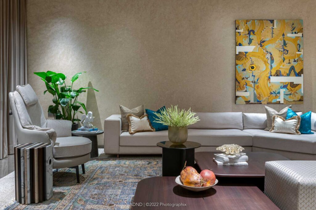
The client is an ardent collector of art; so the designers focused the theme around the art, rather than creating a detailed kind of a shell. Interestingly, the house already had a structure of four bedrooms and bathrooms, so no spatial planning was required. The client needed all the four bedrooms – one for his parents, two for his children (son and daughter each), and one for himself.
The house inherits a long corridor from the main entrance door, and is disconnected from the main living room and dining space. These are anomalies or challenges of the high rises that are coming up in Mumbai.
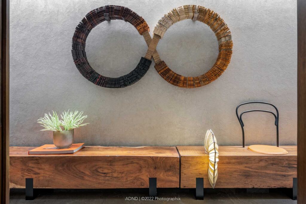
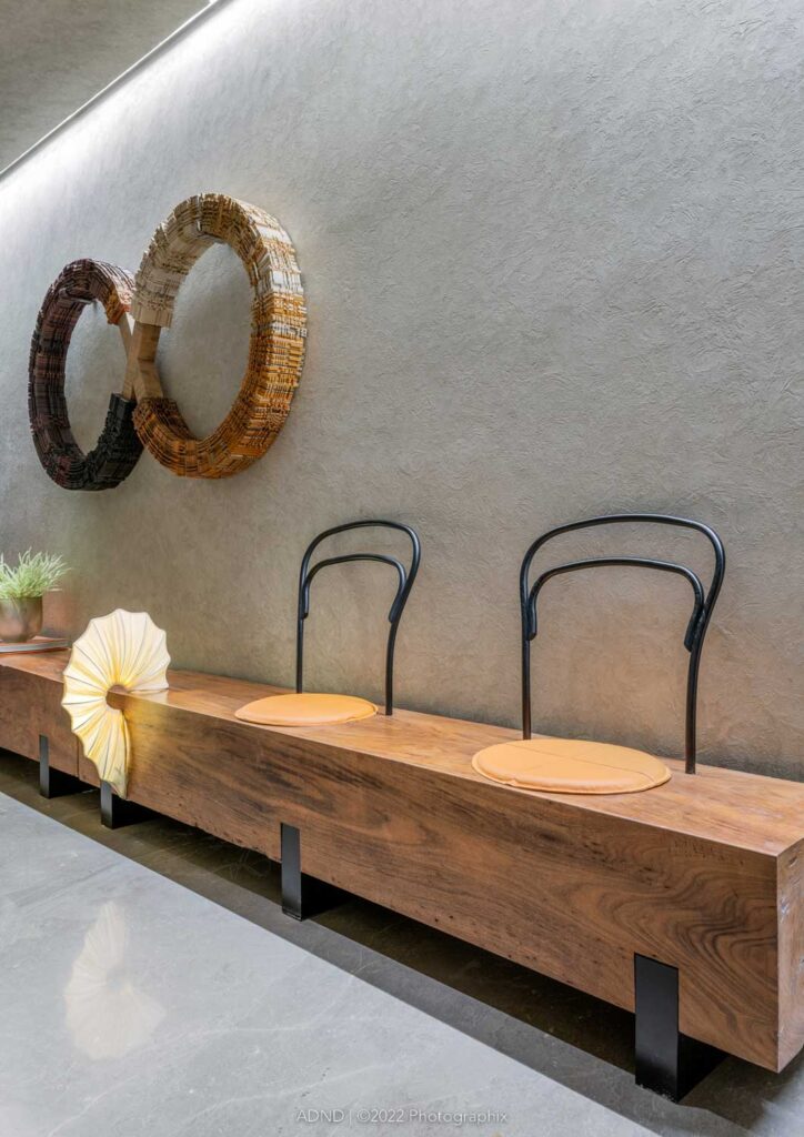
When you enter in the house, you arrive at this long corridor. The idea was to enhance this long walk because it being a passage, and there was no heavy requirement of storage, being a second home. An idea of log of wood, driftwood, was explored, which was integrated with interesting seats that were custom designed in wood log. They were adorned with a cabinet at the end which engages with this wood. It allowed having a grazing wall onto which an Infinity art was put up, made by artist SevalRaj. The wall opposite the bench is adorned by artist Sebastian George. Between these two arts is the parents’ room.
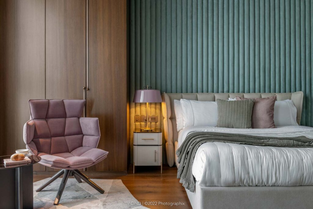
When you enter the parents’ bedroom, there is a sweet arrangement in the sense of seating, lounge arrangement as soon as you enter. The other side of the bedroom has the bed and the side table, and the TV entertainment unit. The design here is held together by a very long extended headboard, which is taken up to a waist level height. It holds both the lounge area as well as the bed. Above that, at equal extremities of the headboard, is an interesting wallpaper, which is the main story or the hero of this room.
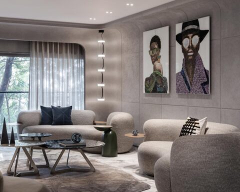
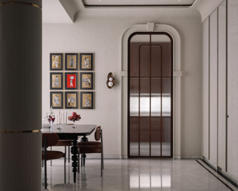
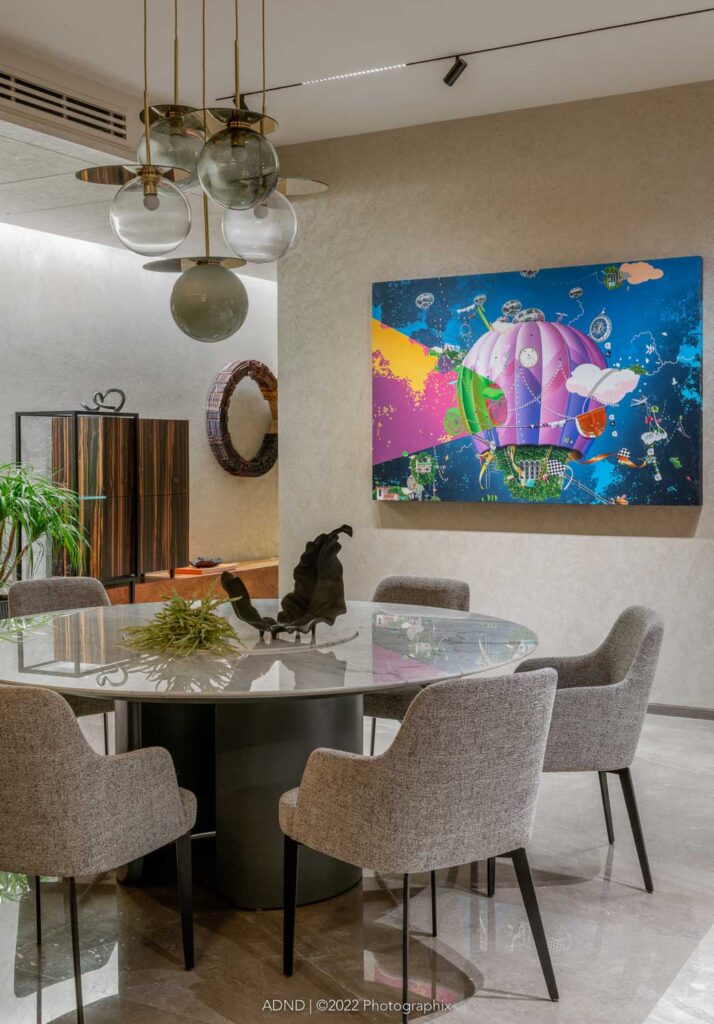
From the corridor, straight ahead, all of a sudden the bottle neck opens up into a very vast living dining space. What is intriguing is that from the entrance corridor, you get a glimpse of a large wooden installation on the wall by Martand Khosla. On the left, when you turn, you see a large dining table, opposite, which is an interesting artwork, Thukral&Tagra.
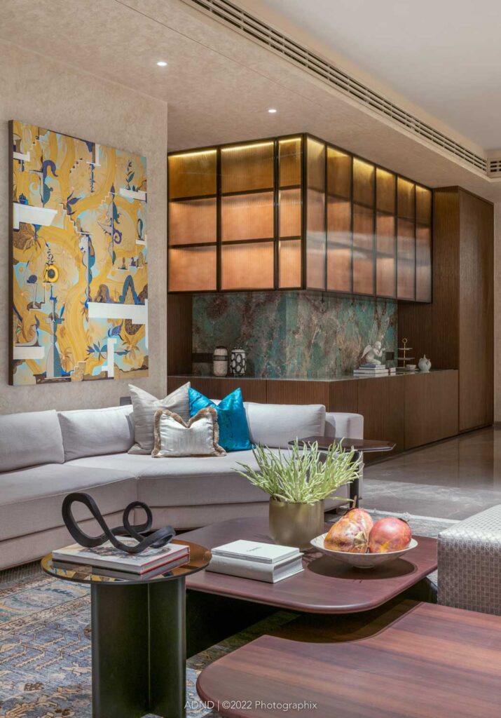
The backdrop of the dining area is exotic marble console with storage and above that are fluted glass cabinets which become display cabinet cum storage cabinet. The reason for taking this particular style of designing of flutes on the shutters was the fact that on one side, it forms a pantry cabinet and the storage, and the other end of the flutes turns to form a U-shape – the vertical of the pantry, the horizontal of the console, and then again vertical, where the column is camouflaged. Adjacent to the column is the entry into the son’s bedroom. The flute not only holds the corridor and the corner together but it also helps to camouflage the massive column.
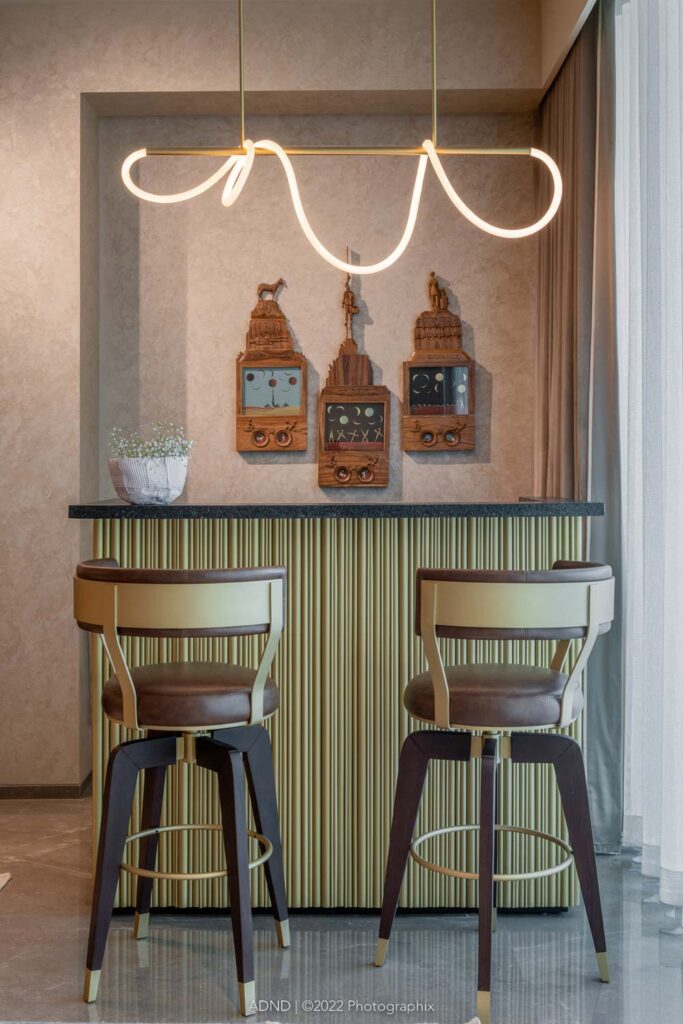
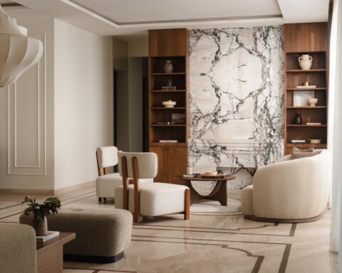
The living room has been looked at as a social gathering space. It has been kept devoid of traditional television or entertainment unit, due to the fact that it is a second home and is looked at as purely a space for entertaining and relaxing. The corner engages with the bar, above which is an artwork above, the living room there is the Jagannath Panda artwork. The living room has an attached balcony which overlooks the sea link.
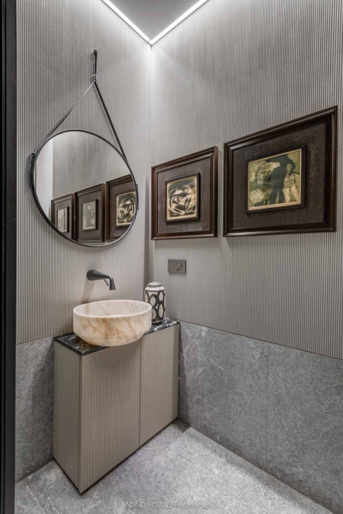
Between the living room and console there is a small passageway, where, tucked in is the powder toilet behind the living room. On the right is the son’s room, the first in the line. The design plays along the lines of youngster and masculinity. There is a play of black and white stripes and bold Moroso sofa is kept in the corner with an orange pop colored table. The bed is held together with the Dalmata Italian marble as the backdrop. On either side of it there is the storage cabinet.

In all the rooms, the wardrobe space is not in front of the living room space, because wardrobes are heavy pieces of furniture. They are tucked away and is planned in a way that it is in front of the bathrooms and not in front of the bedrooms and the lounges. Again, in the son’s room, there is a corner which turns delicately with a set of 6-7 paintings.
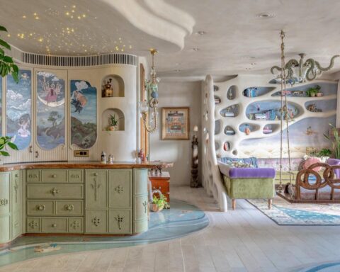
Outside the son’s room is the daughter’s room. The daughter is extremely young, so to provide a feminine flavor, the colors are chosen more on the pastel shades. The headboard is rounded fluting with soft padding which is being provided over the independent headboard of the bed. The lights that are chosen are extremely delicate in nature and look like earrings and pendants, in which one is a table lamp and the other is a hanging light. The design of the dresser is taken from the idea of a traveling trunk, which is a trunk kept on a trunk.
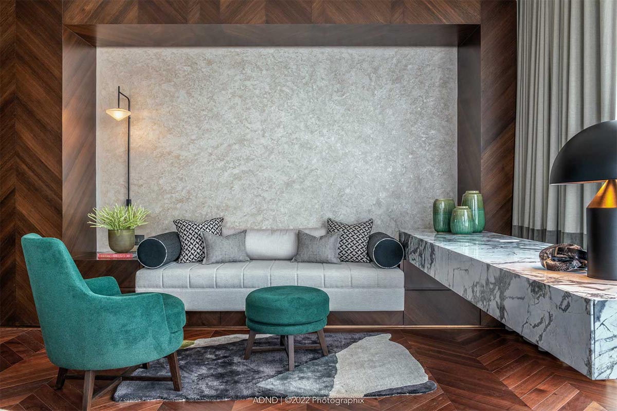
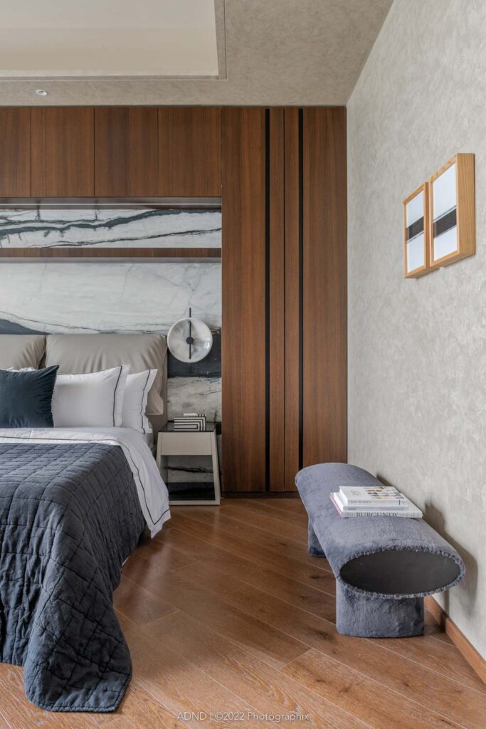
The master bedroom, which is at the end of the flat, opens up into a lovely space in the middle where there is the wardrobe facility leading to a diwan area, a sitting area in the bedroom, with expansive views on two sides and an L-shape format. Here, there is a cantilevered marble study juxtaposed with a TV unit in wood which forms one side of the wall. You don’t see the bed as soon as you enter but it is tucked away on the side and enjoys a beautiful leathered finished marble barcoded wall. The headboard here is purposely exaggerated, being the master bedroom, to give it a more luxurious feel with a height which is not typical to headboards.
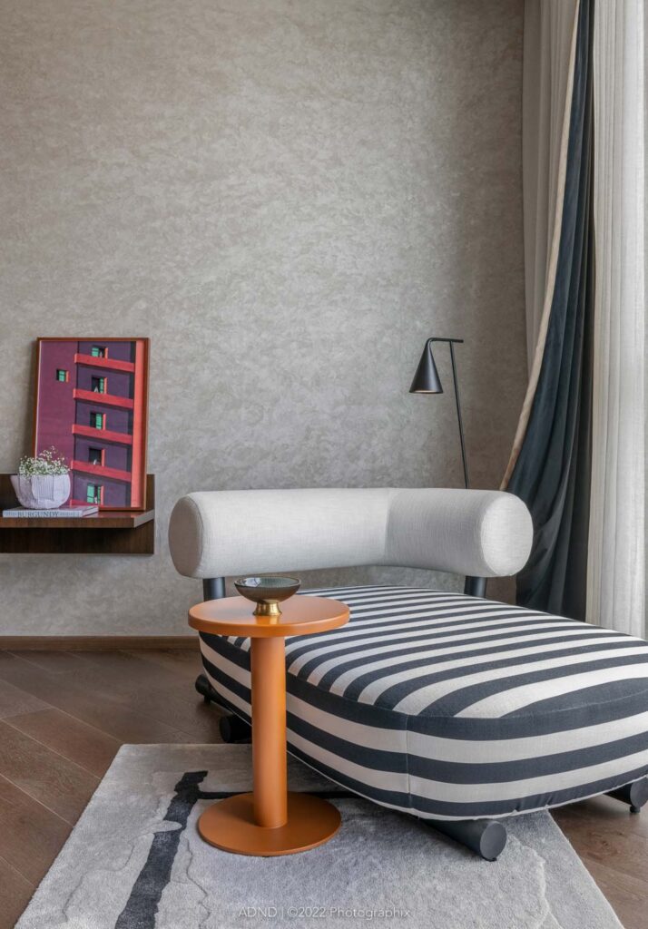
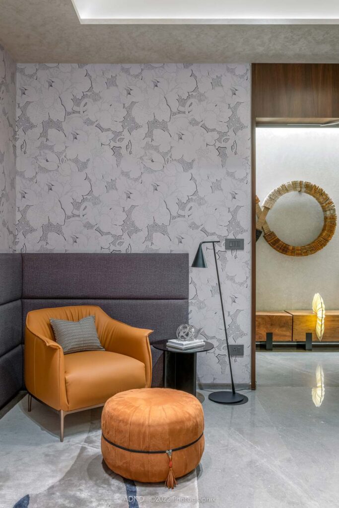
Talking about the color palette, the shell had to be kept extremely neutral, because of client’s heavy investment in art. Being an art collector, he is constantly in influx with the art moving in around between his homes. So there wouldn’t be one permanent space for the art. Art, having its own array of colors, the designers needed to make sure that the shell would be mute and have a canvas that absorb those colors. Besides being explored in different materials and each artist having his own bias toward his medium, their colors have also shined through their respective arts. So it was more about picking the artwork for the walls rather than color for the house. Even the furniture had to have the shades and tones which would complement those works. Also, it was recognized that if, in future, the art changes, it is not arrested with the furniture, which was being married to the previous art. So the colors were kept keeping the artworks in mind.
There were certain challenges that were faced while designing. The corridor was the most challenging due to its long, bottleneck nature. Considering the fact that it is a second home, the amount of functions that came in that space were very few, which was challenging. Hence, a visual gallery had to be created. Also, the program as per second home was challenging, since it doesn’t allow for permanent fixtures. The idea of art being rotated over a period of time and creating canvases and walls which were open and free to work with was also a challenge.

The entire house showcases ADND’s signature style, because the work is in detail and in theme lines. Every corner and edge of the house reflects two sentiments, keeping it functional and crisp, and no nonsense in a manner so as to create a sense of understated elegance and drama.
Project Name : Art Haus
Project Location : Mumbai, Maharashtra, India
Architects/Designer : ADND
Photographer: Photographix – PHX India


